liha beauty
Unifying a beauty brand across product, web, and digital experience.
LIHA Beauty is a British-born brand rooted in African heritage, known for its intentional approach to body care and natural formulations. The brand is currently stocked in Sephora locations across the UK.
Following a breakout appearance on Dragon’s Den (the UK equivalent of Shark Tank), LIHA Beauty experienced a significant surge in visibility and demand, with key products selling out shortly after. This moment marked a shift in scale, requiring a more cohesive and elevated visual direction across its digital ecosystem.
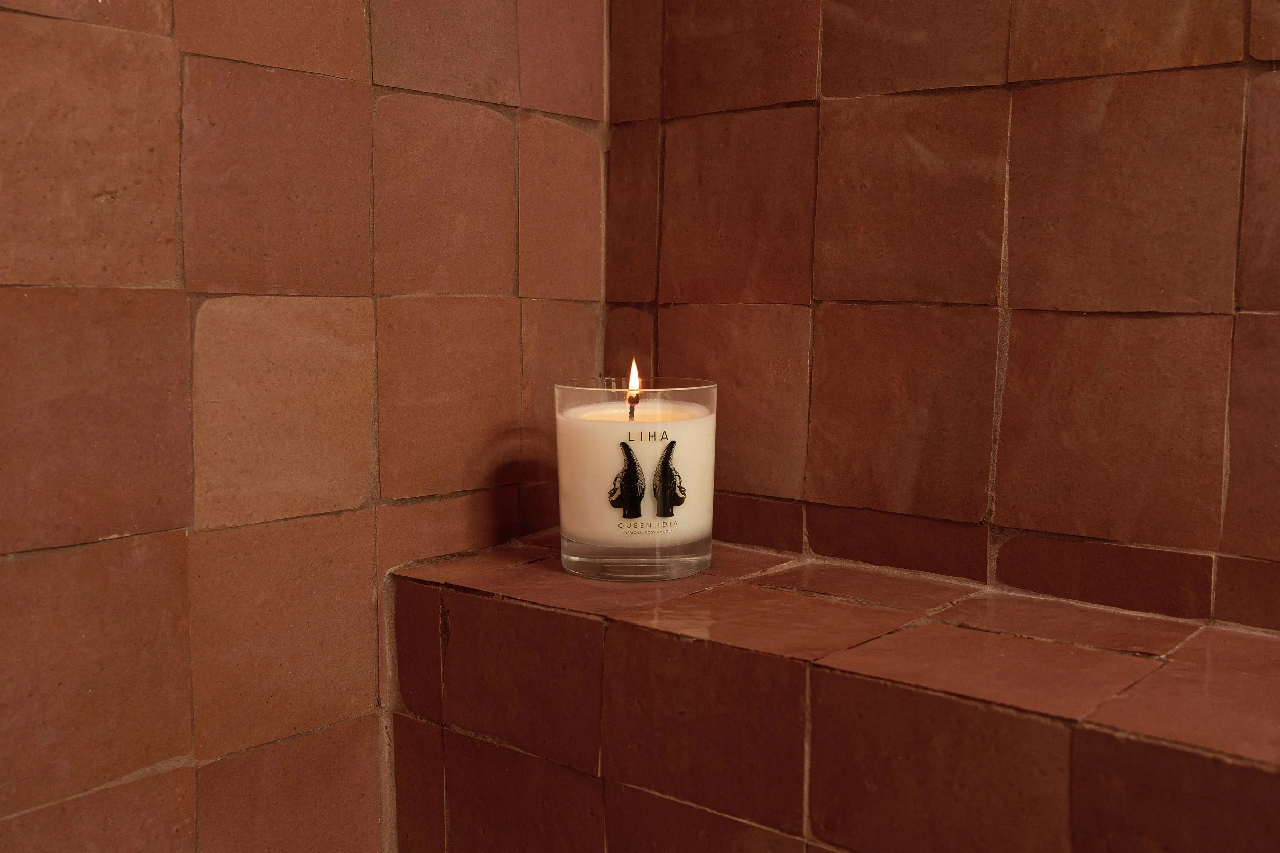
I was brought on to refine and unify how the brand presents itself across product, web, and digital touchpoints. At the time, visual execution varied across platforms, creating inconsistency in how products were experienced. I led the development of a structured visual system that brought clarity, cohesion, and scalability to the brand. This included defining lighting, composition, and color environments, as well as establishing a repeatable framework for product storytelling across all SKUs.
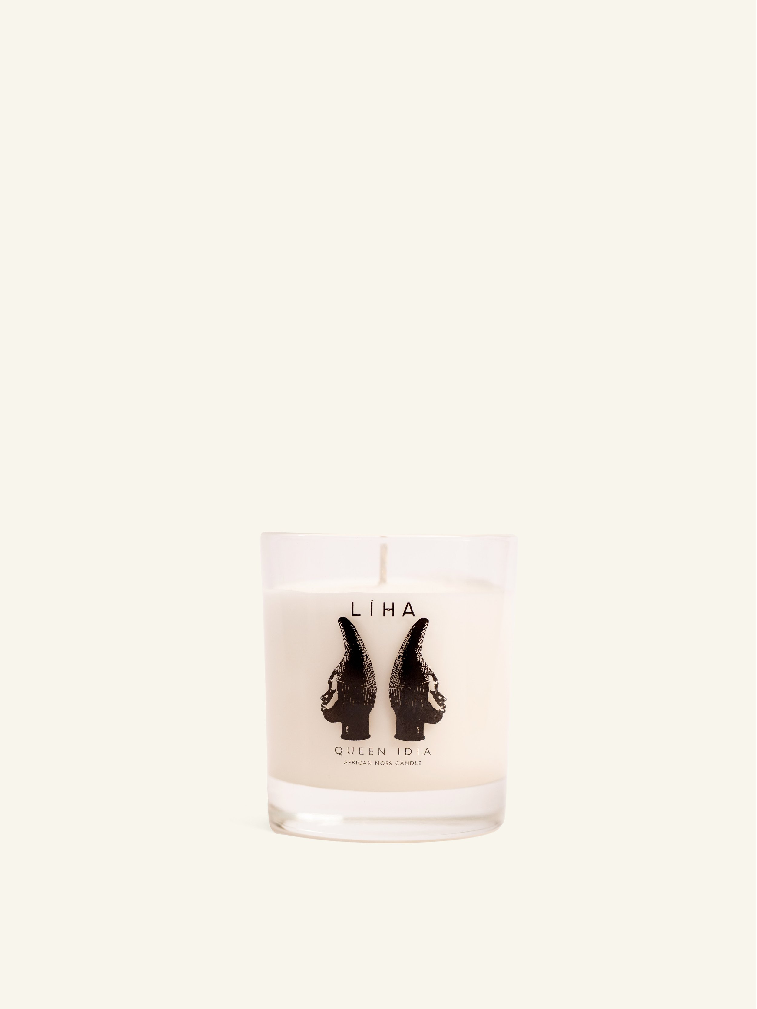
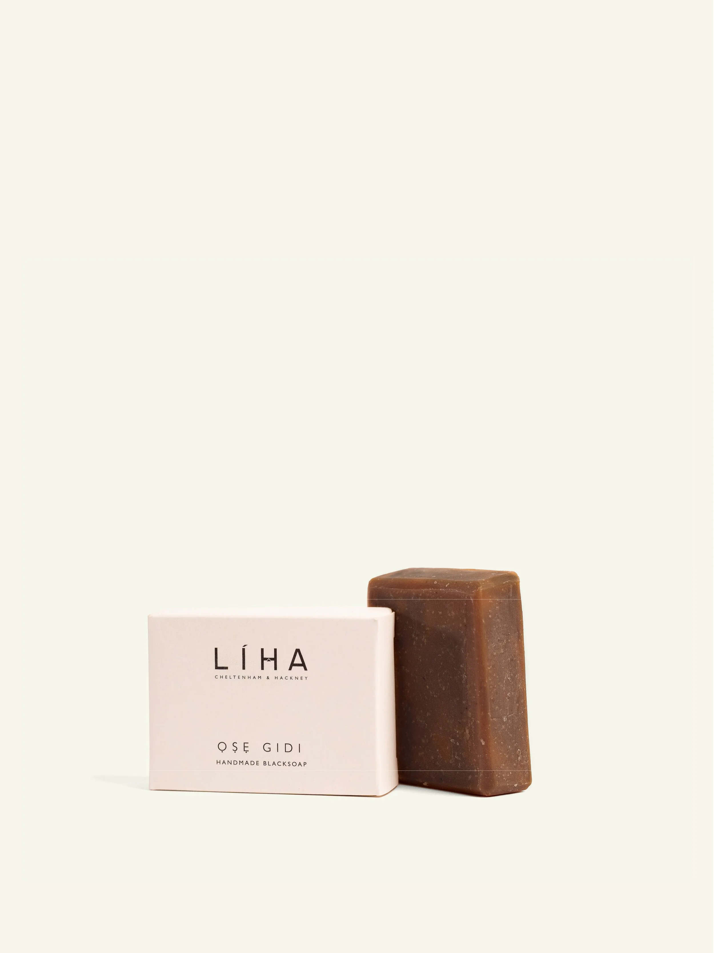
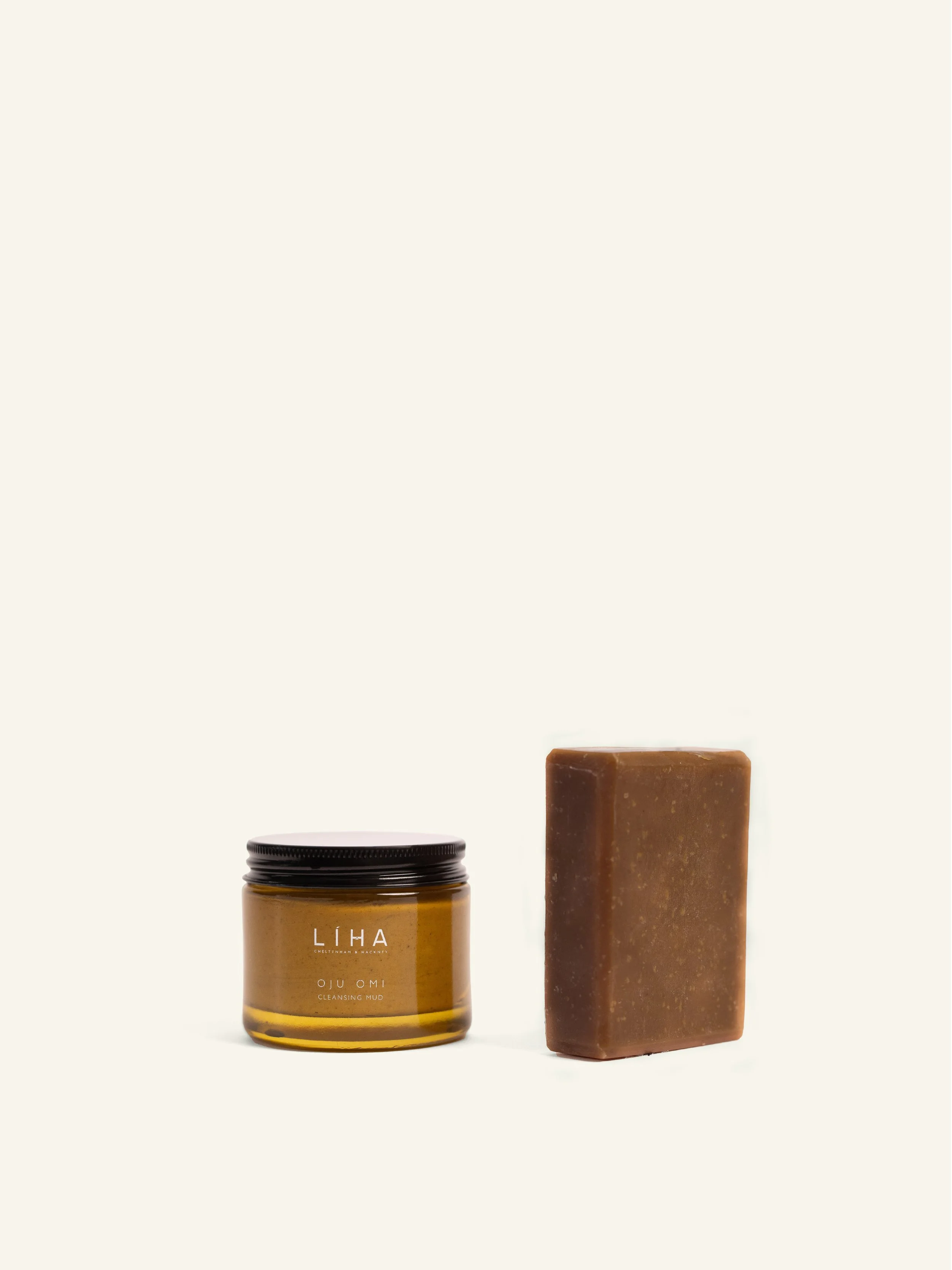
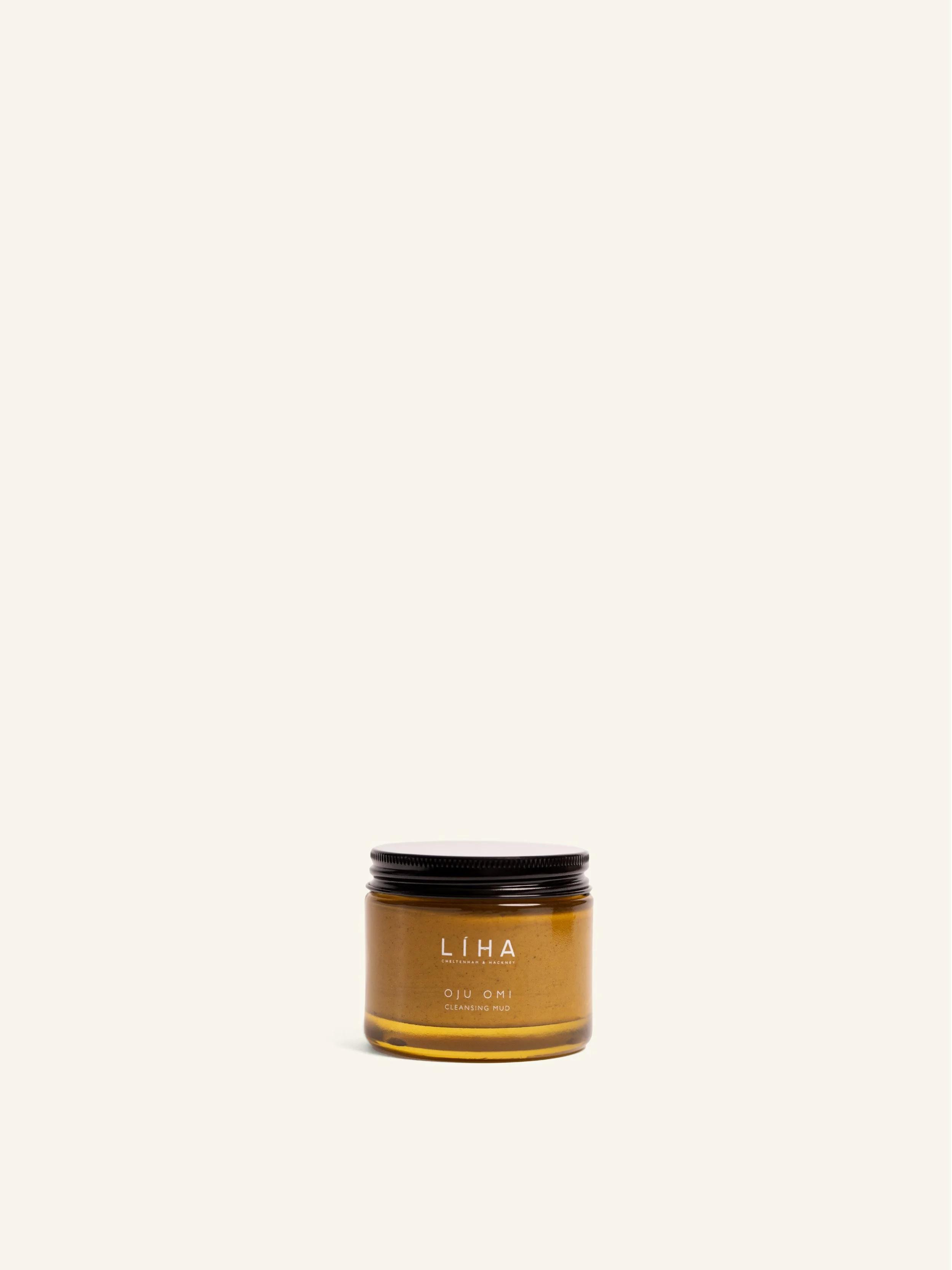
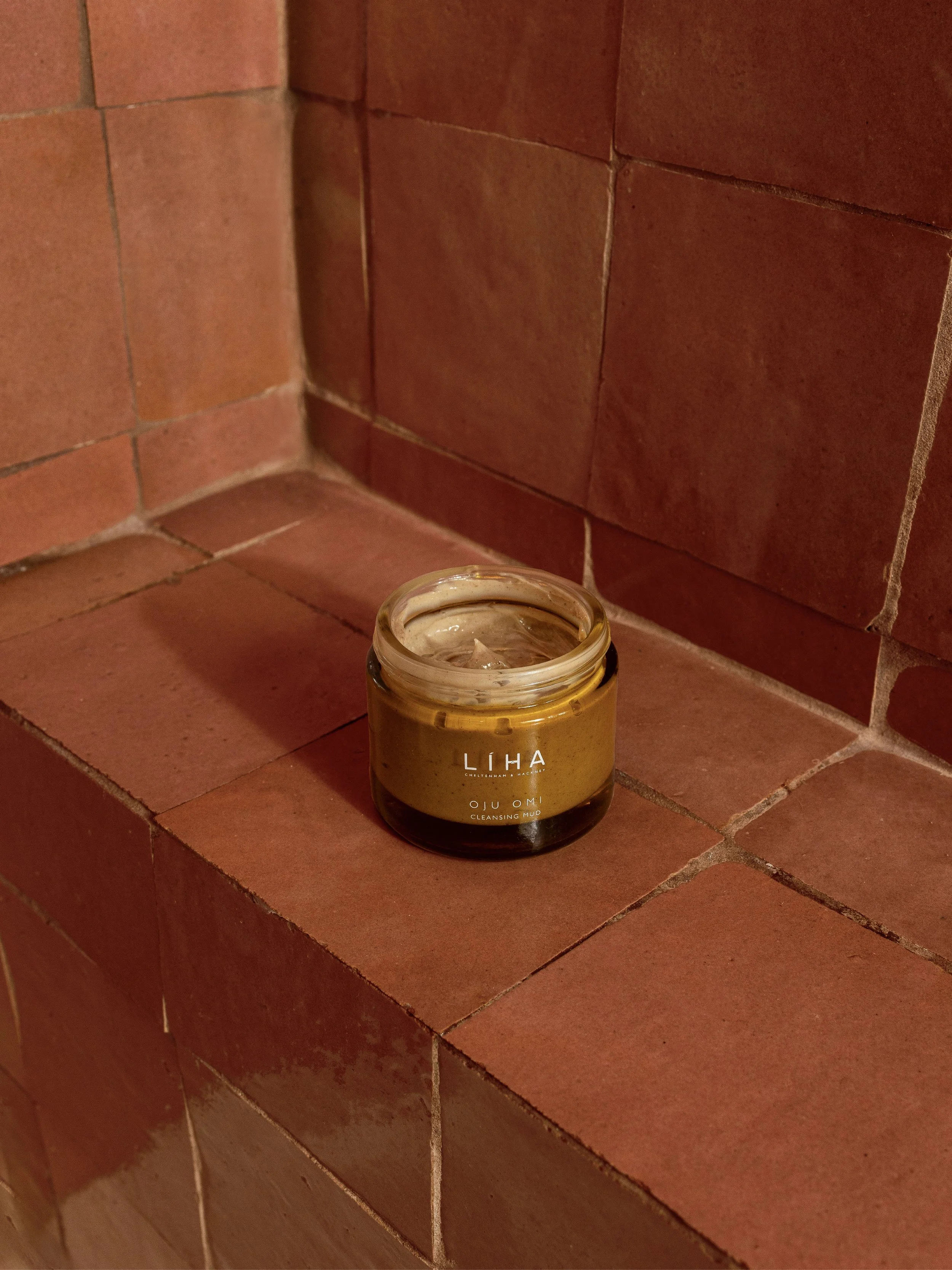
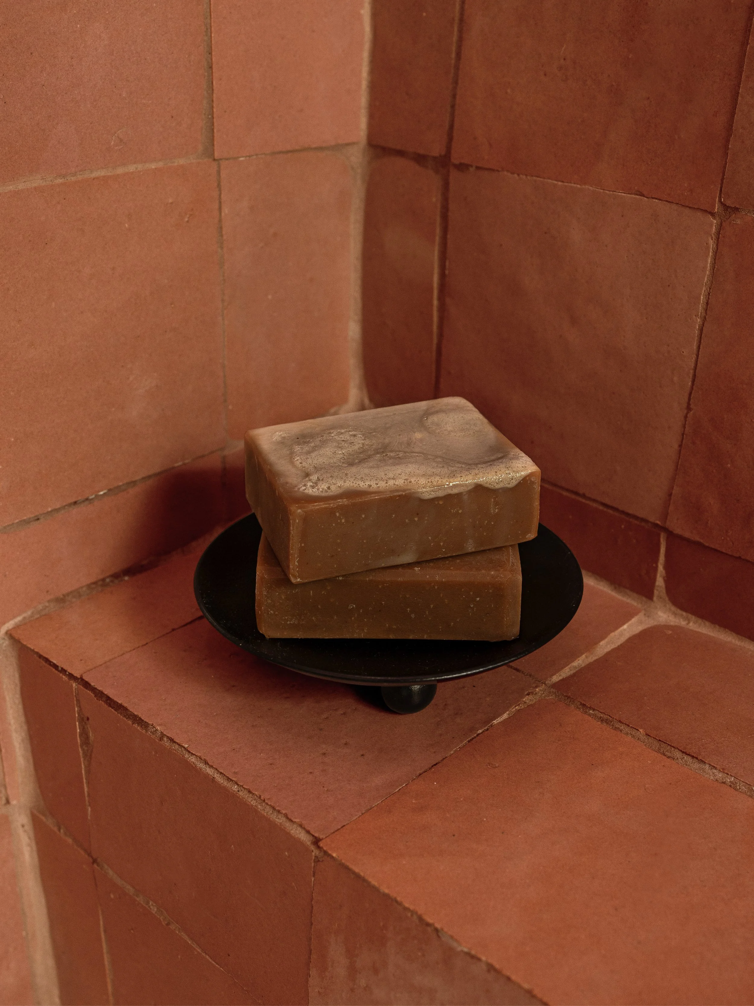
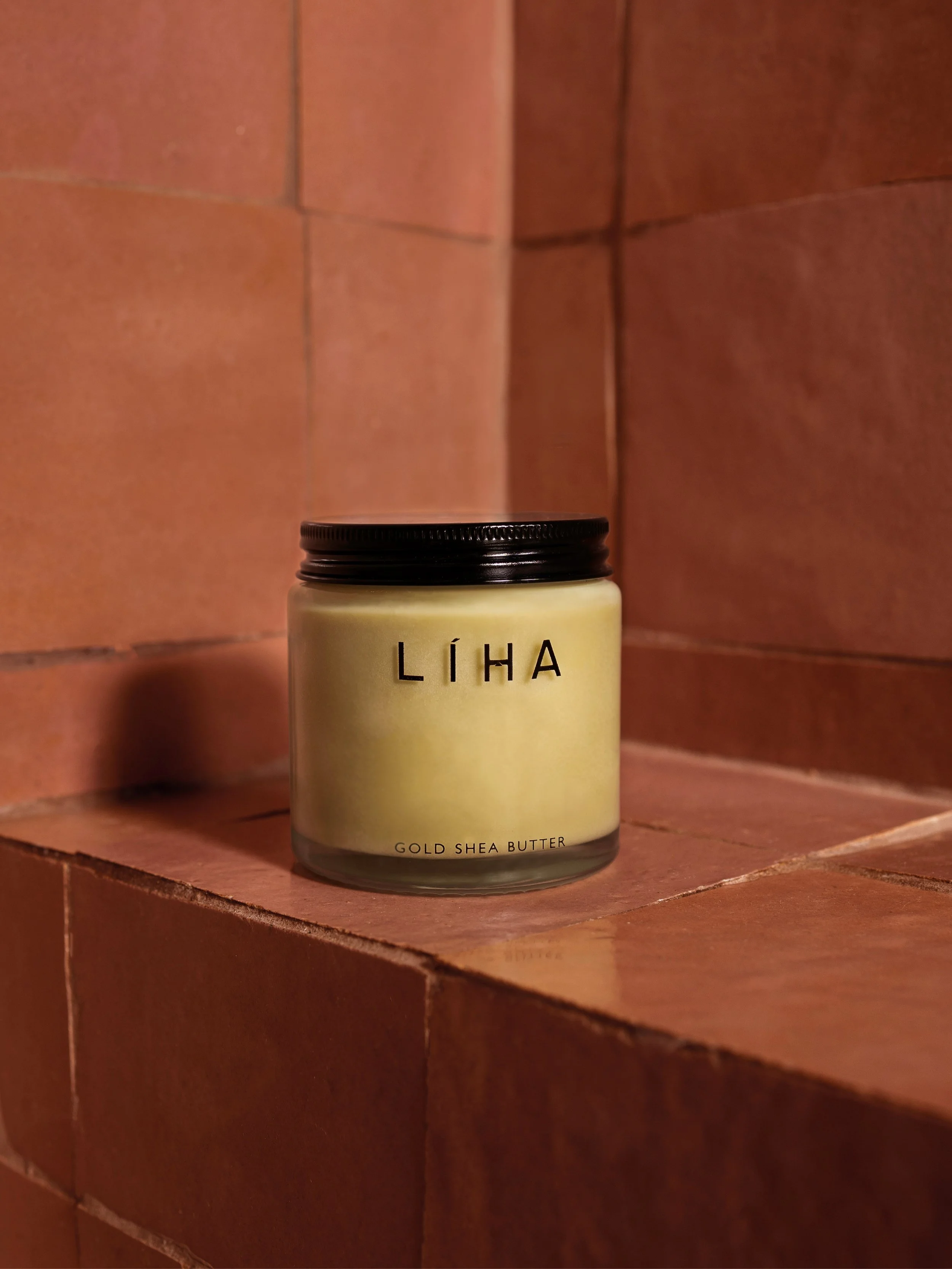
Visual Standardization
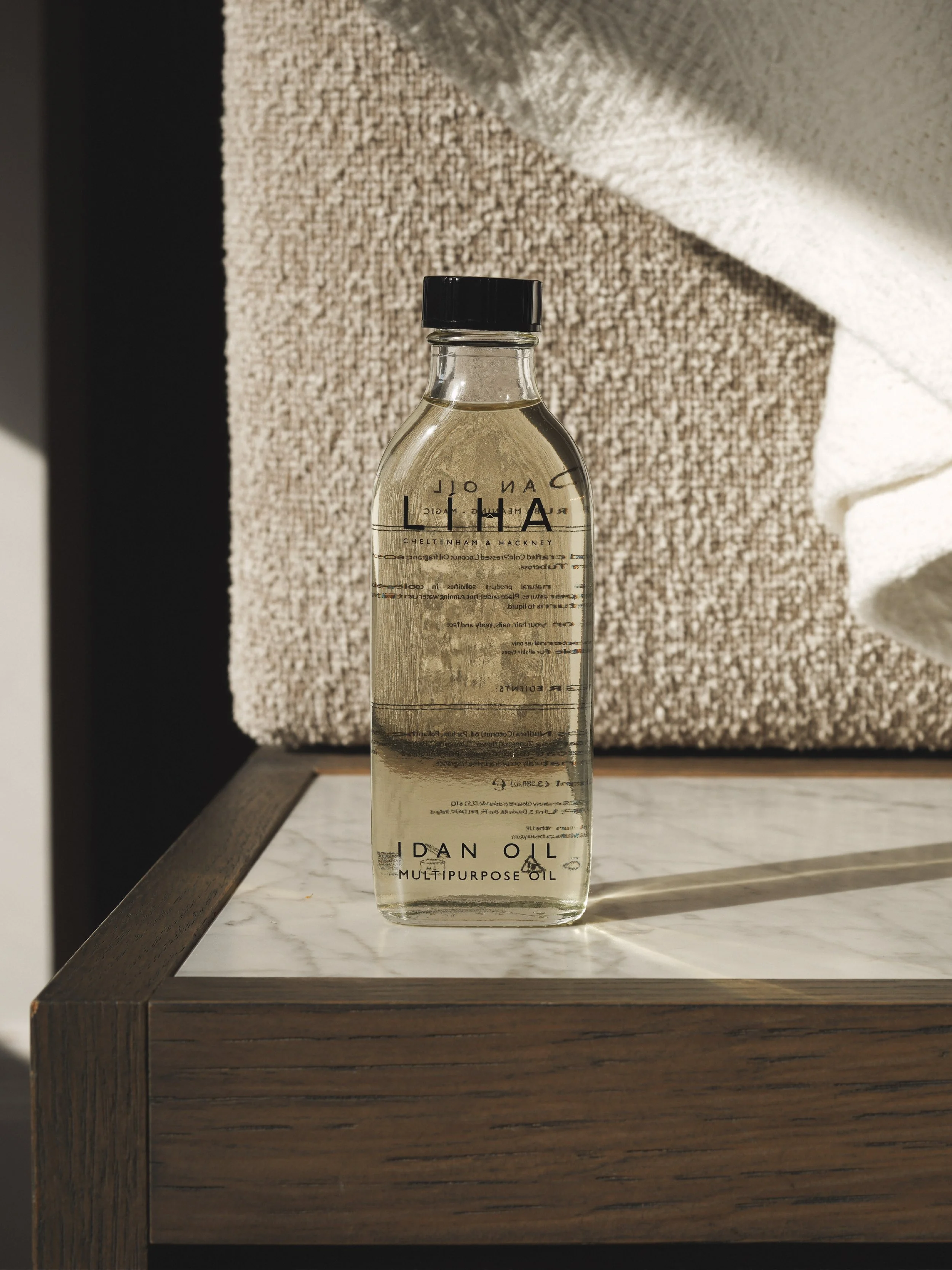
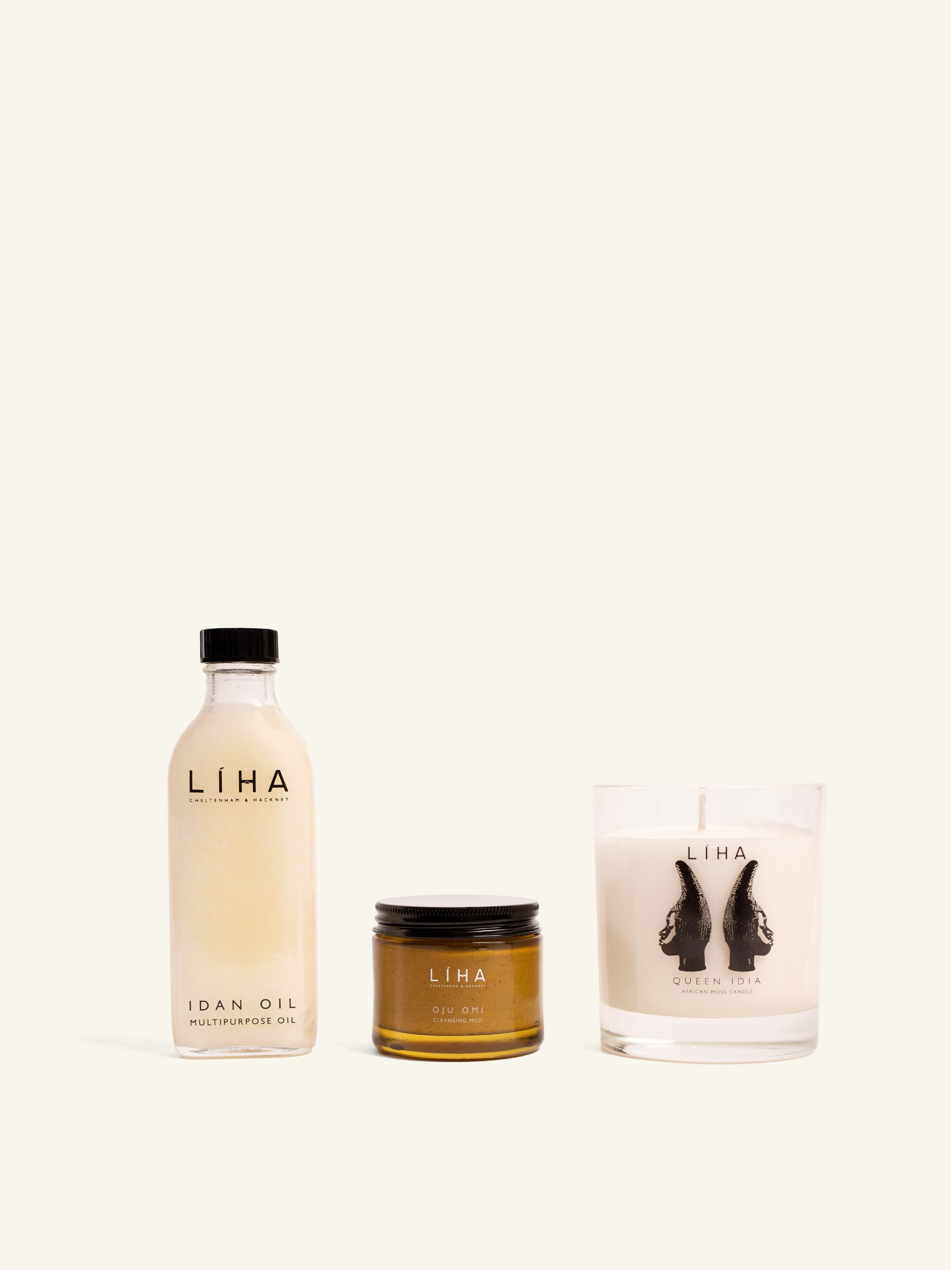
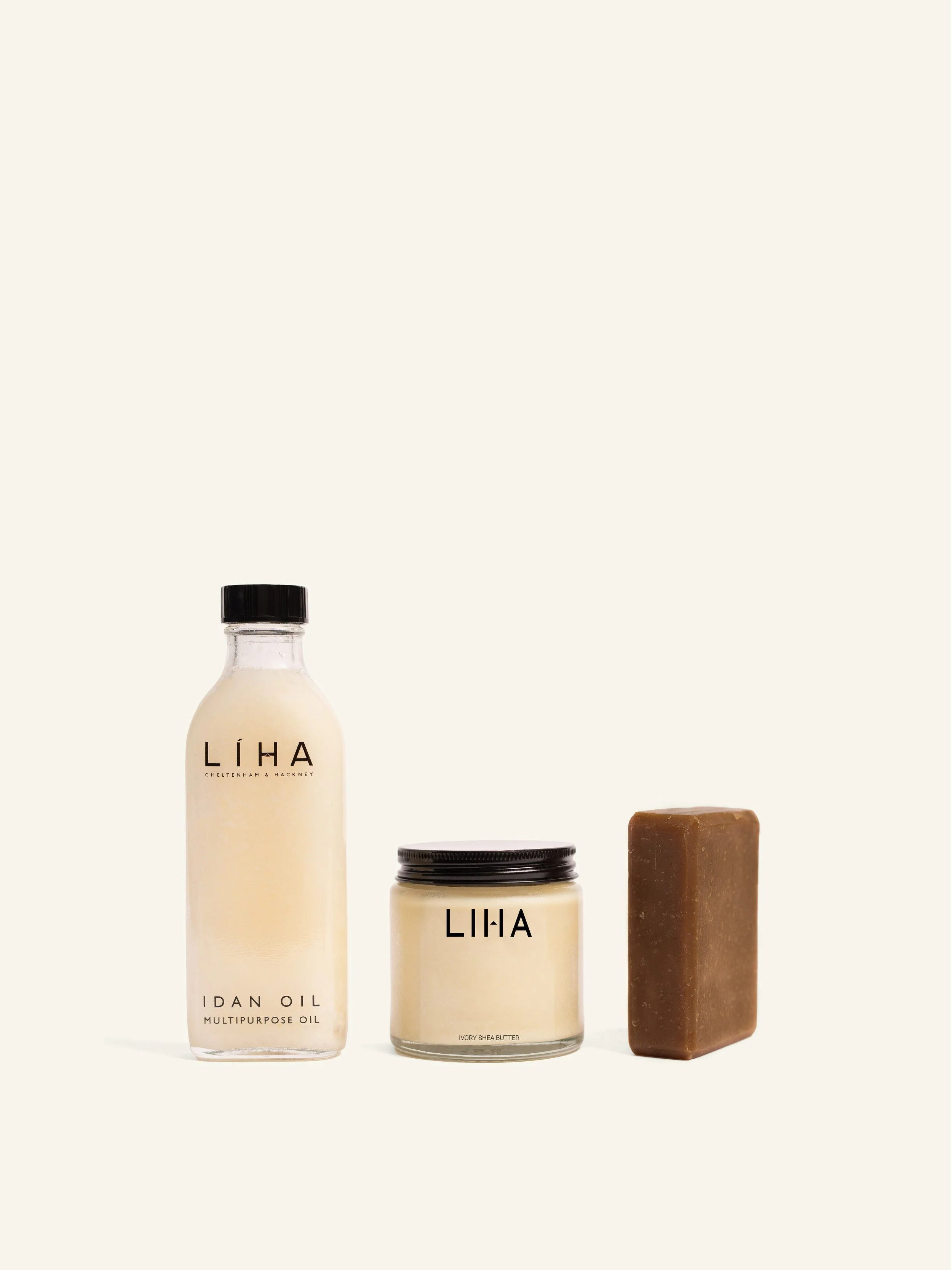
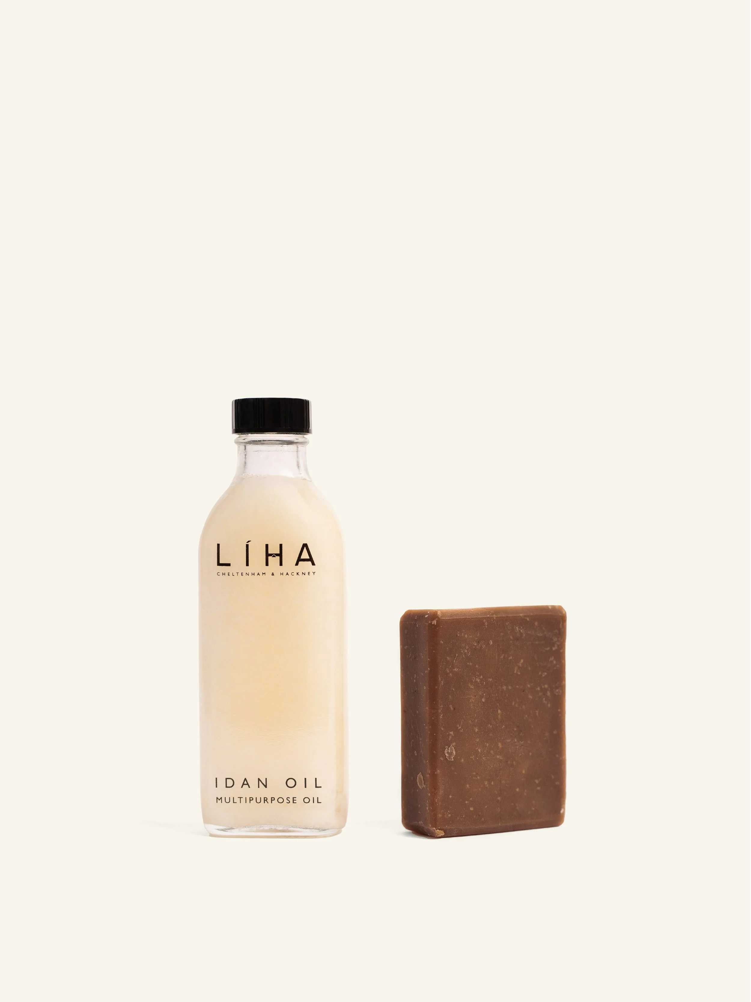
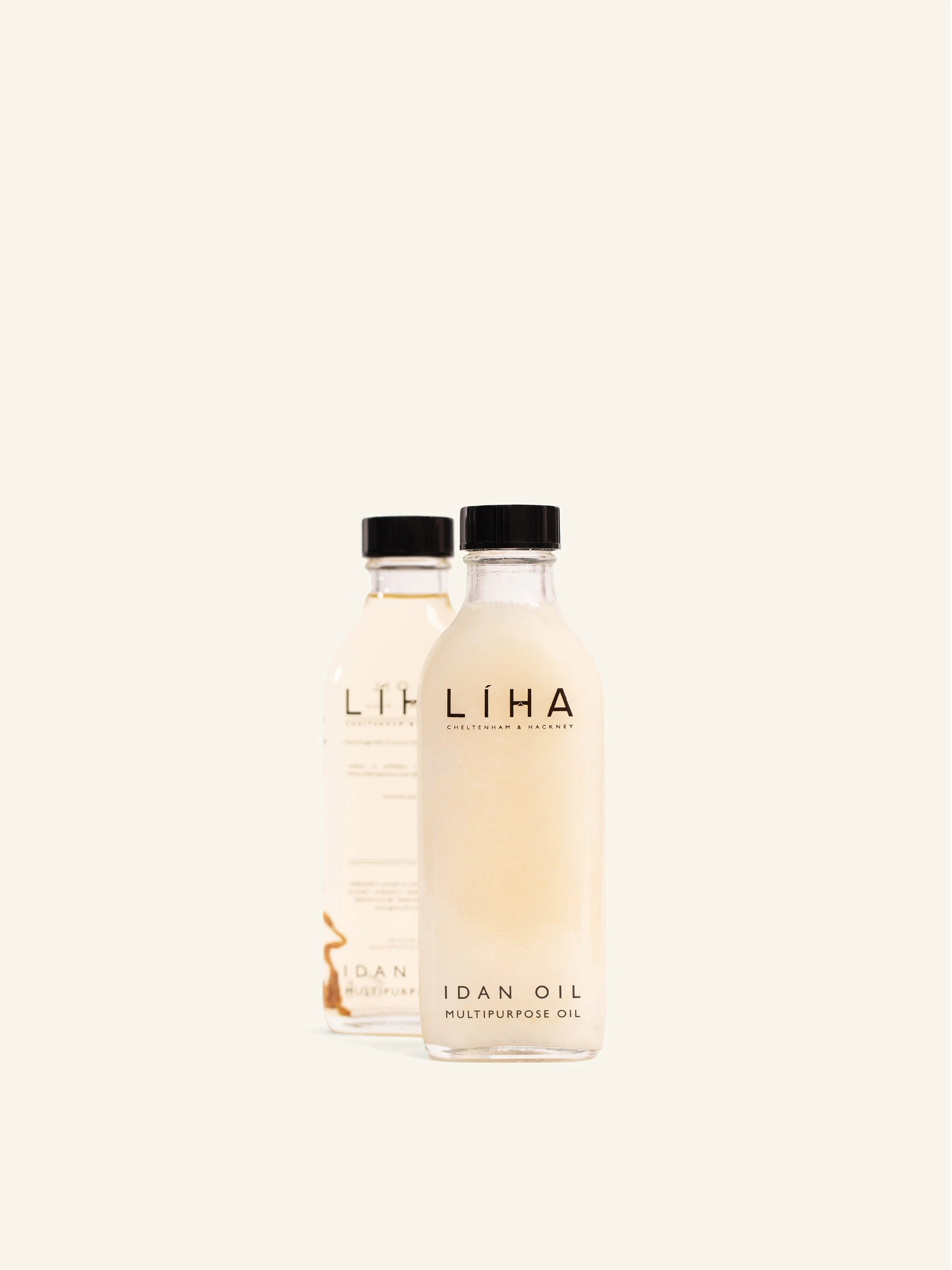
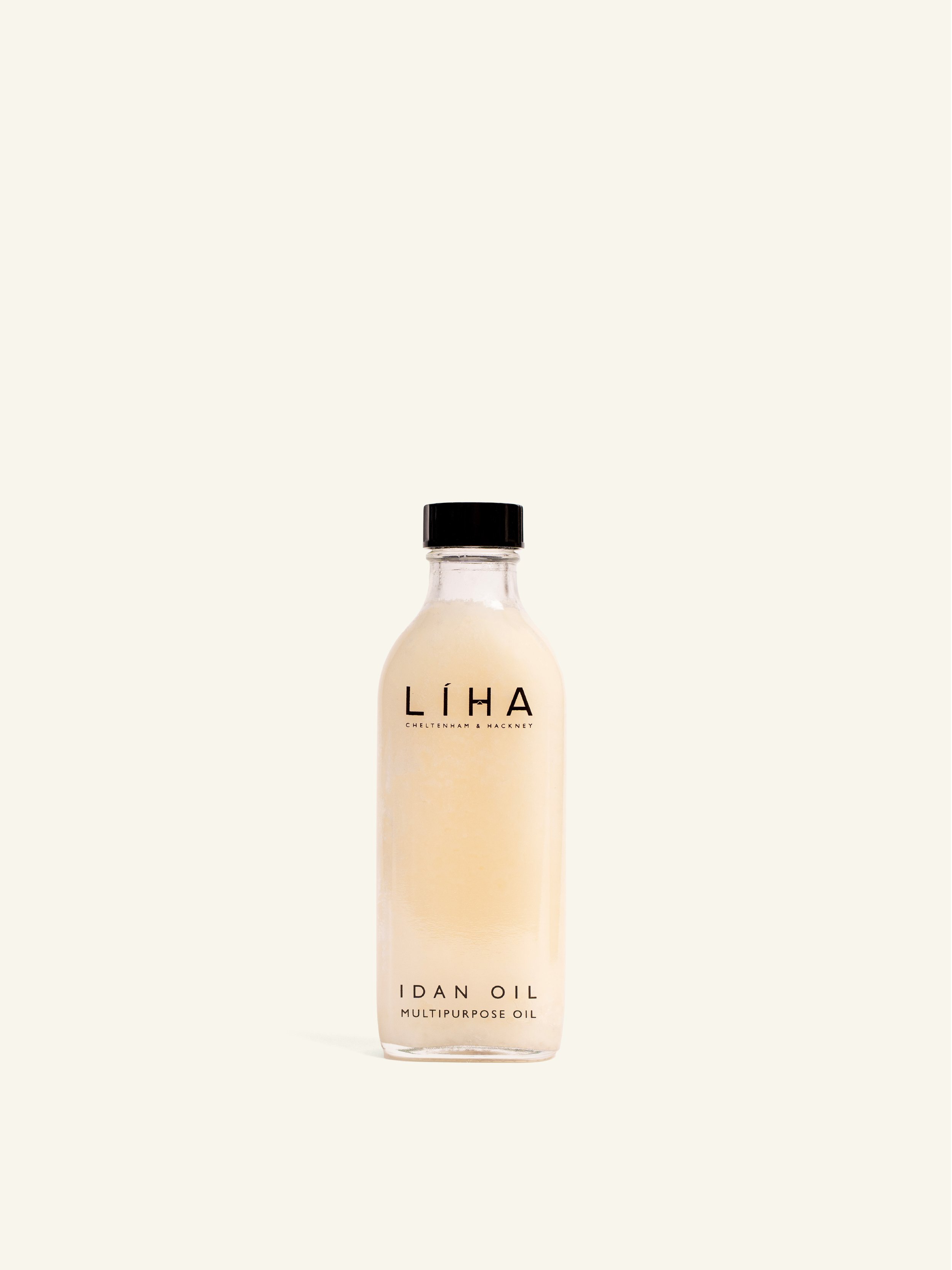
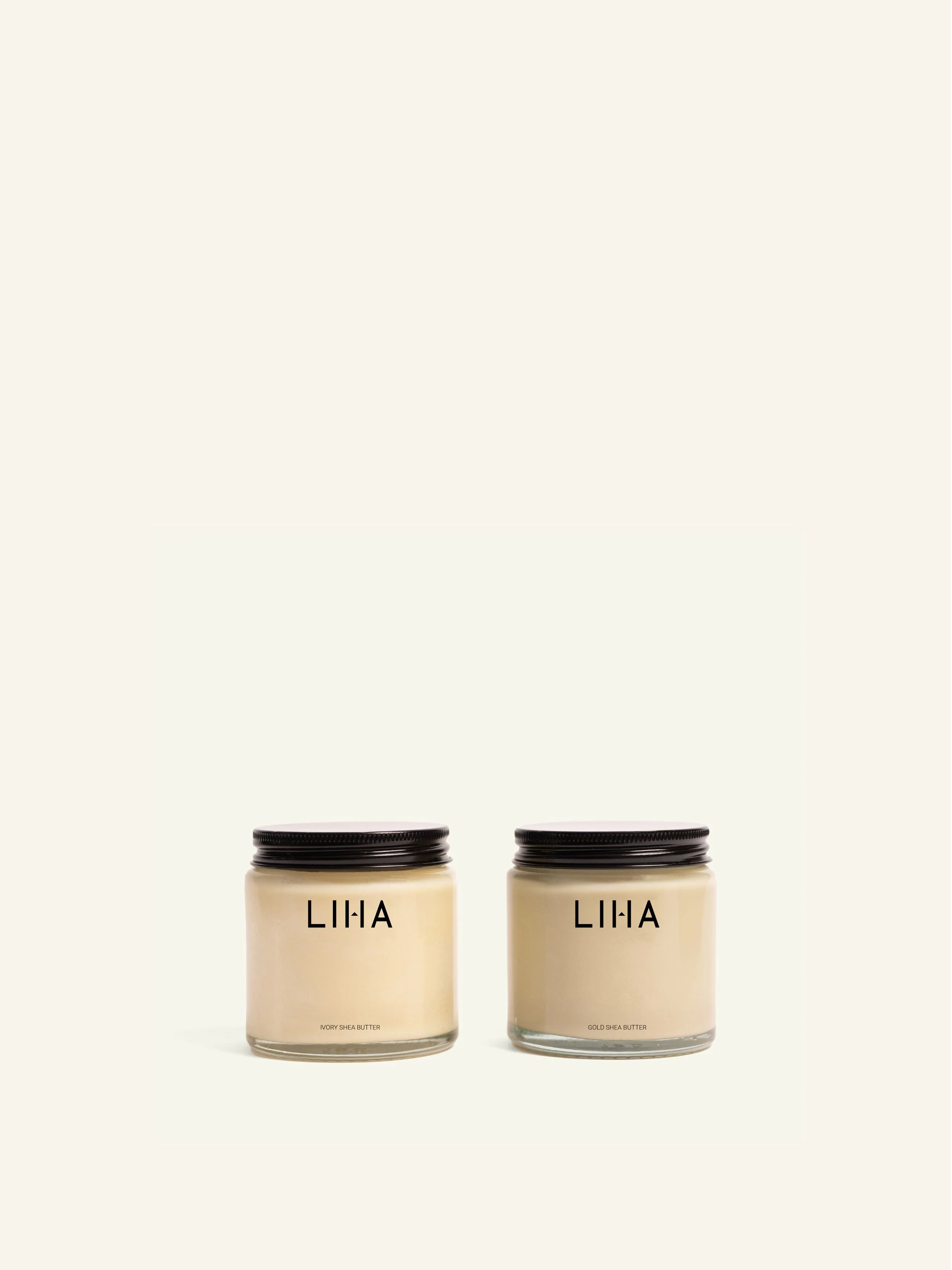
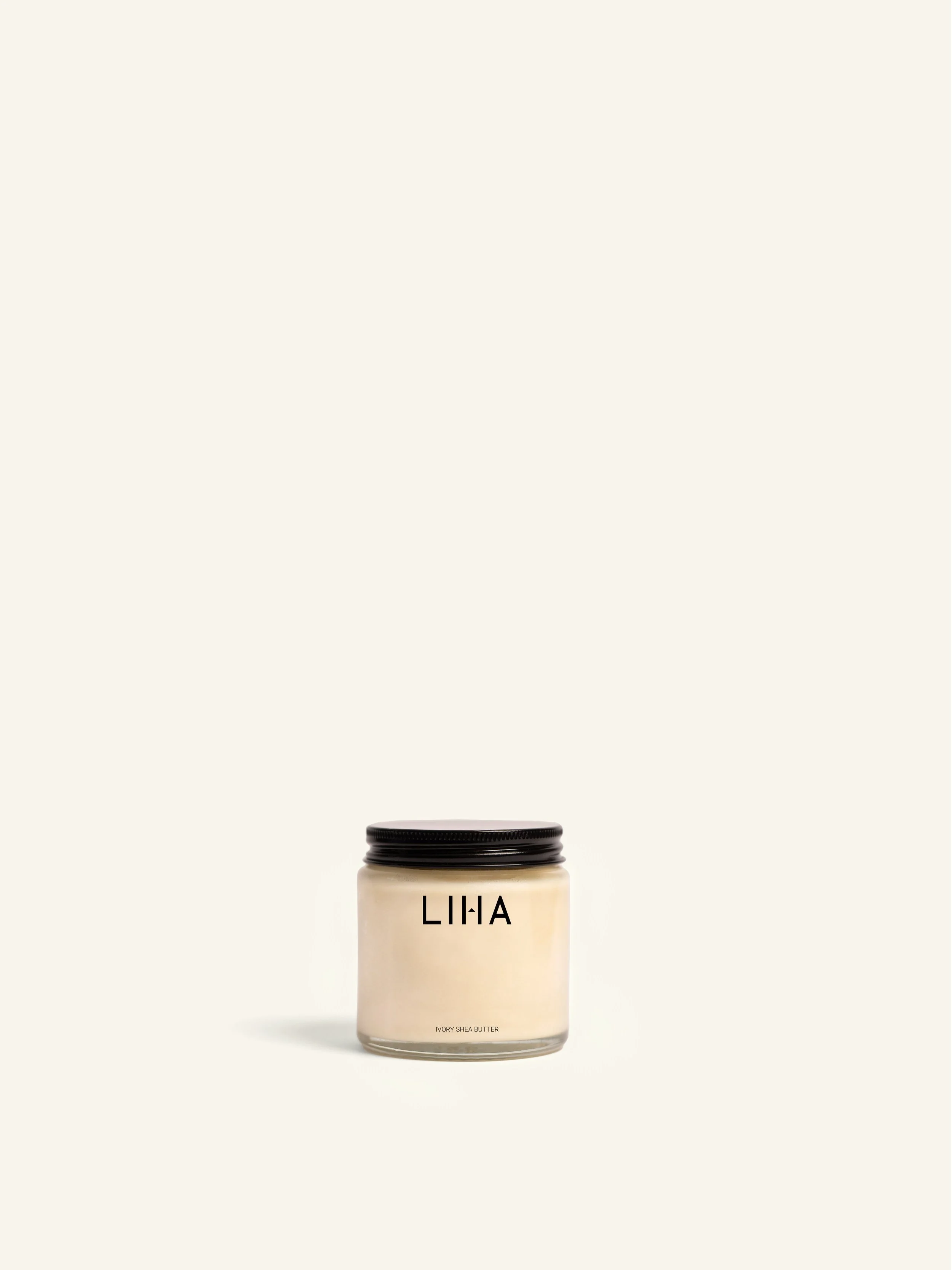
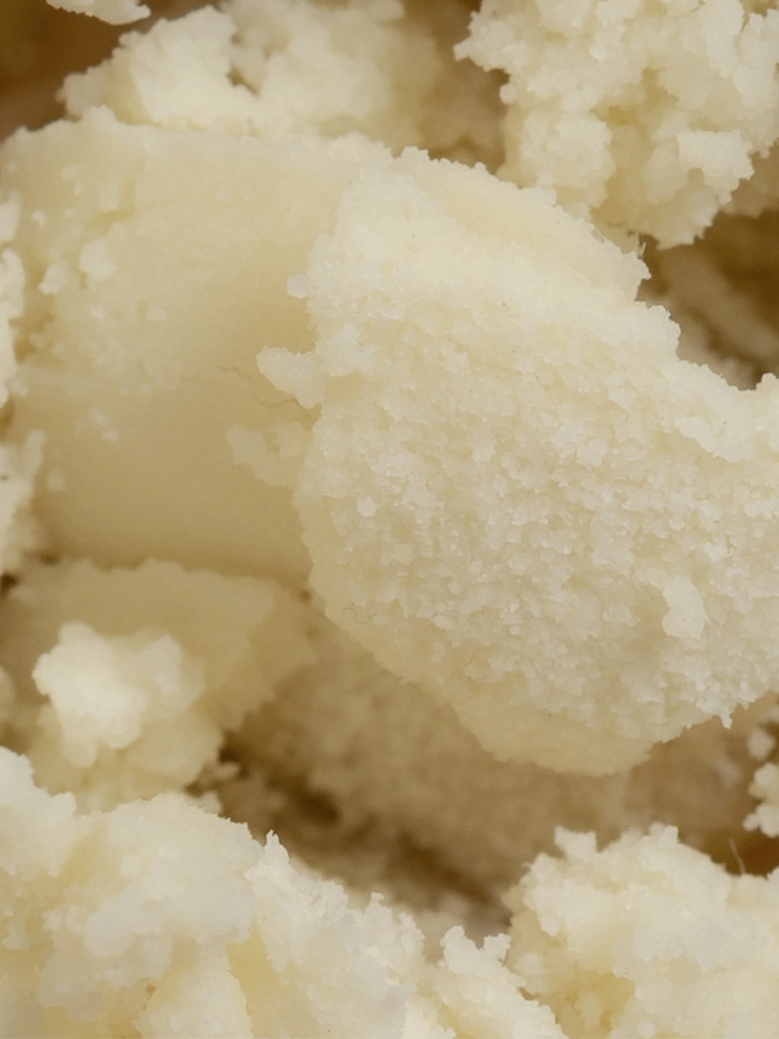
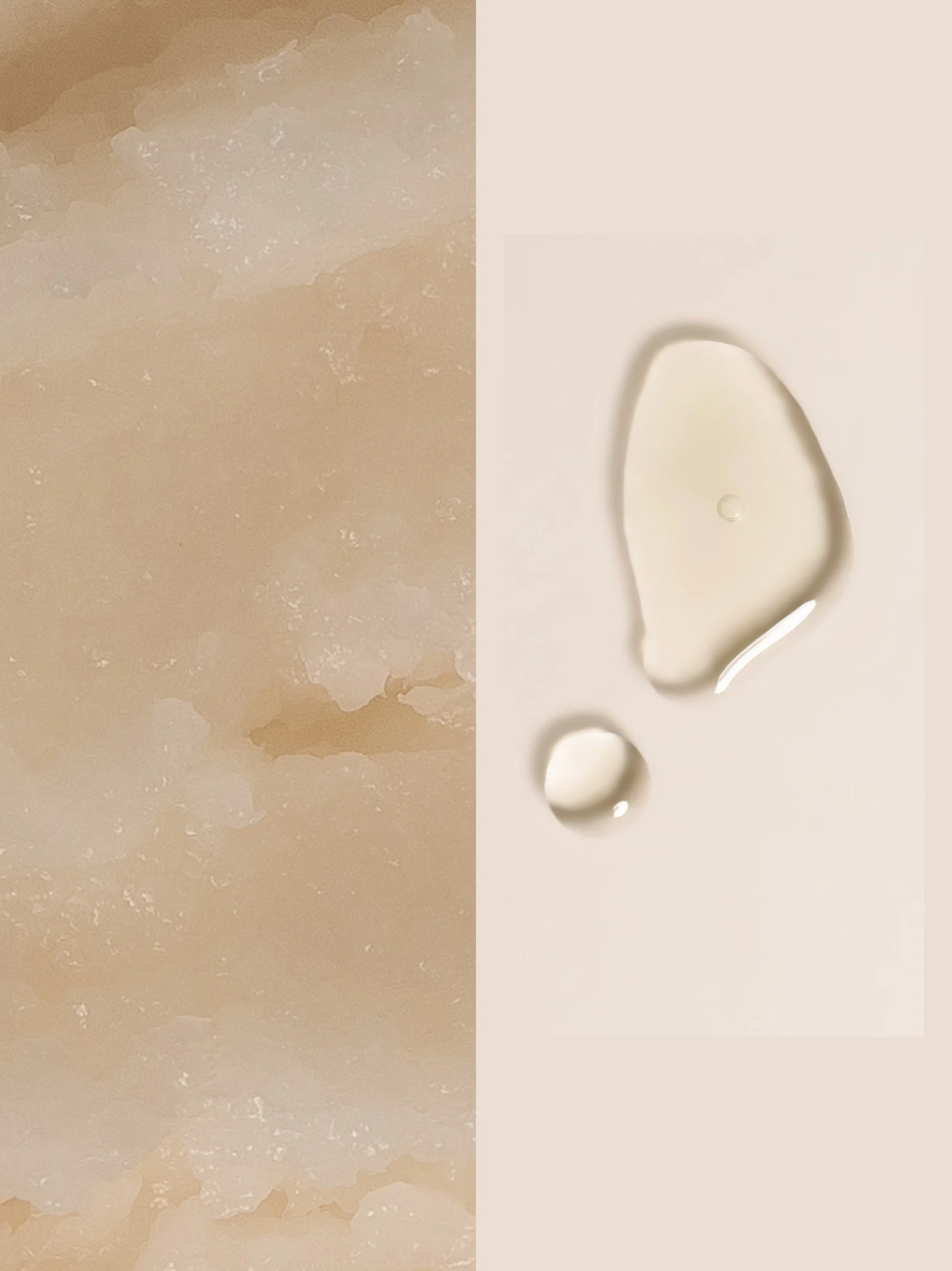
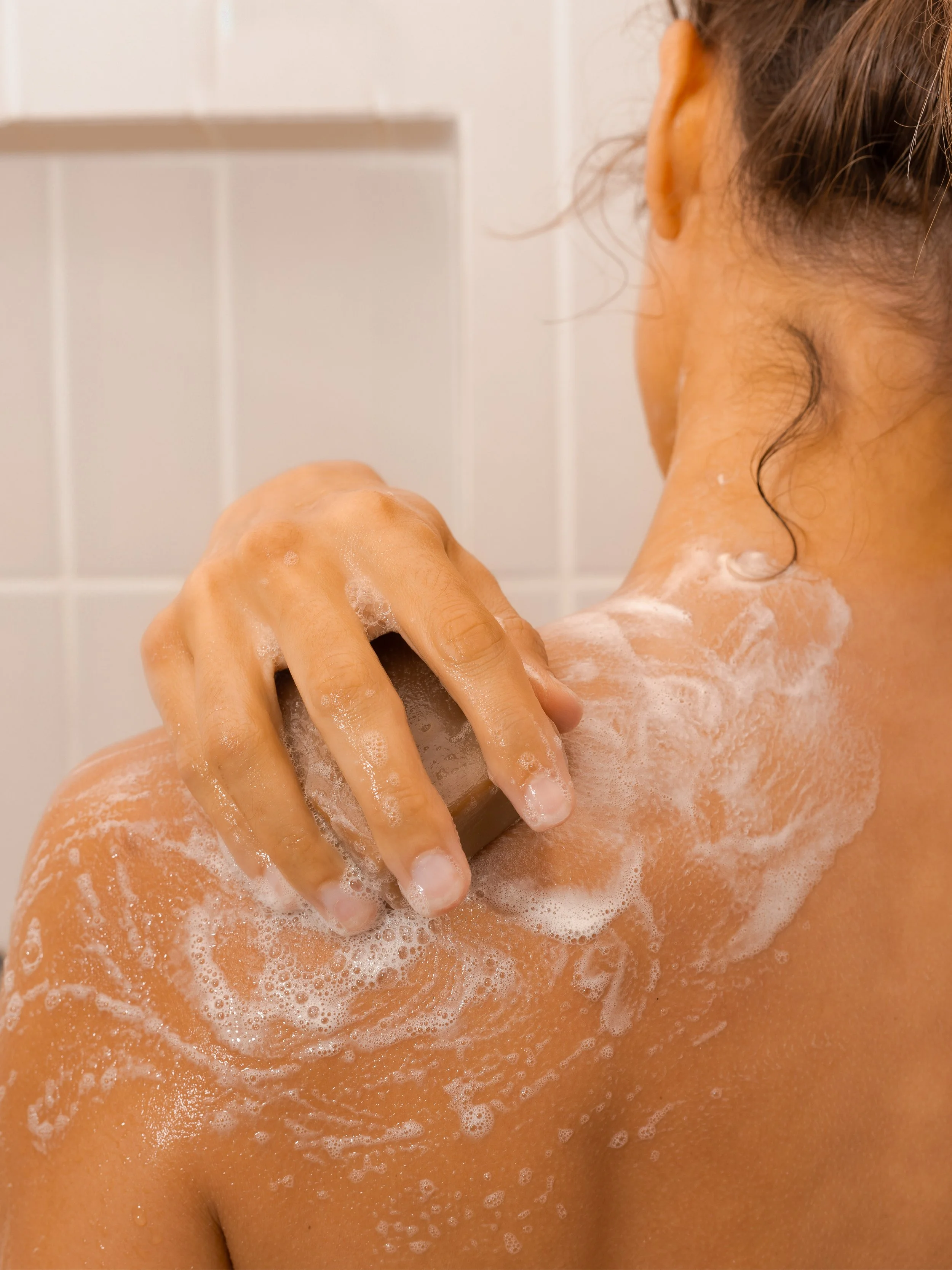
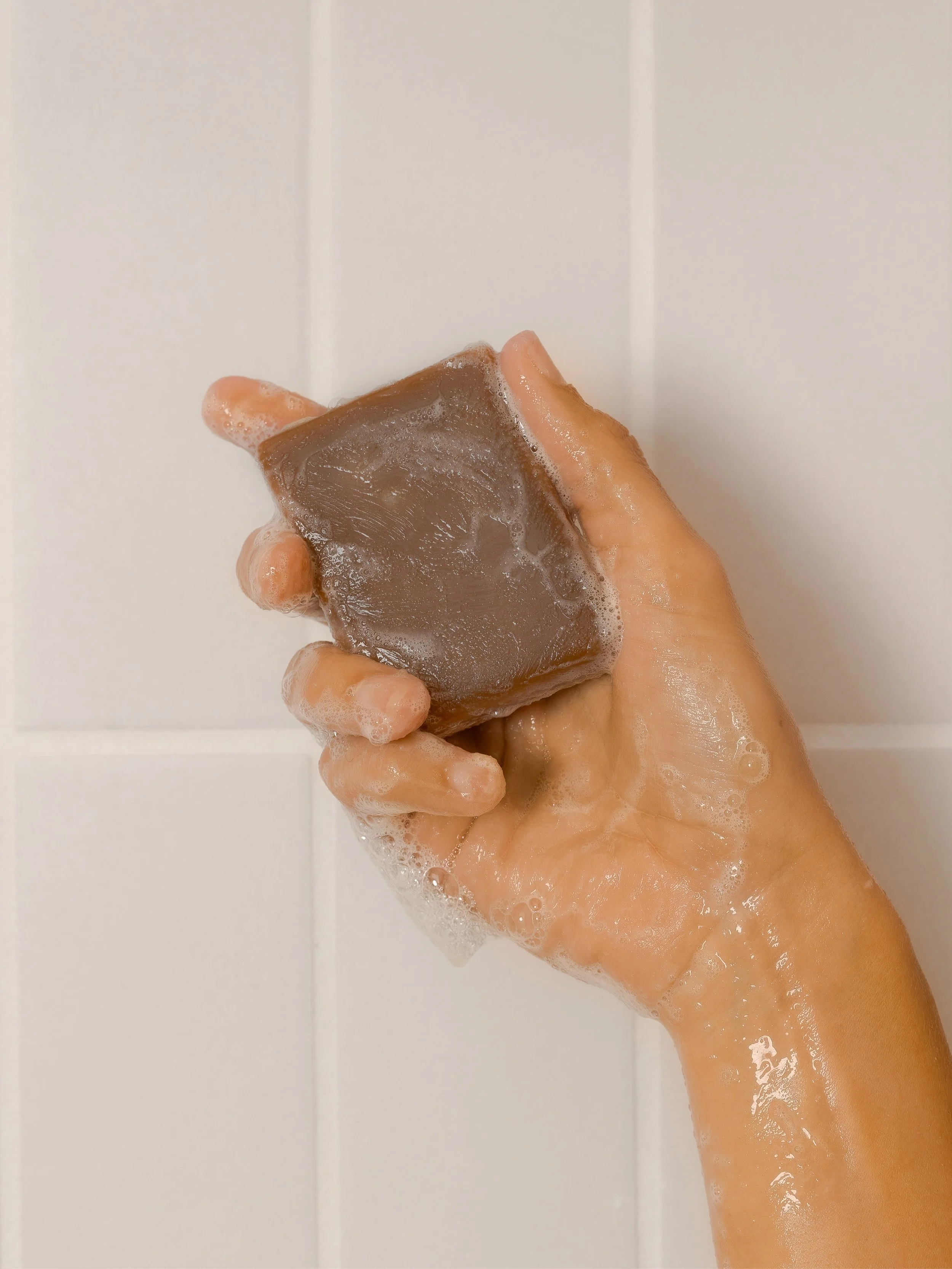
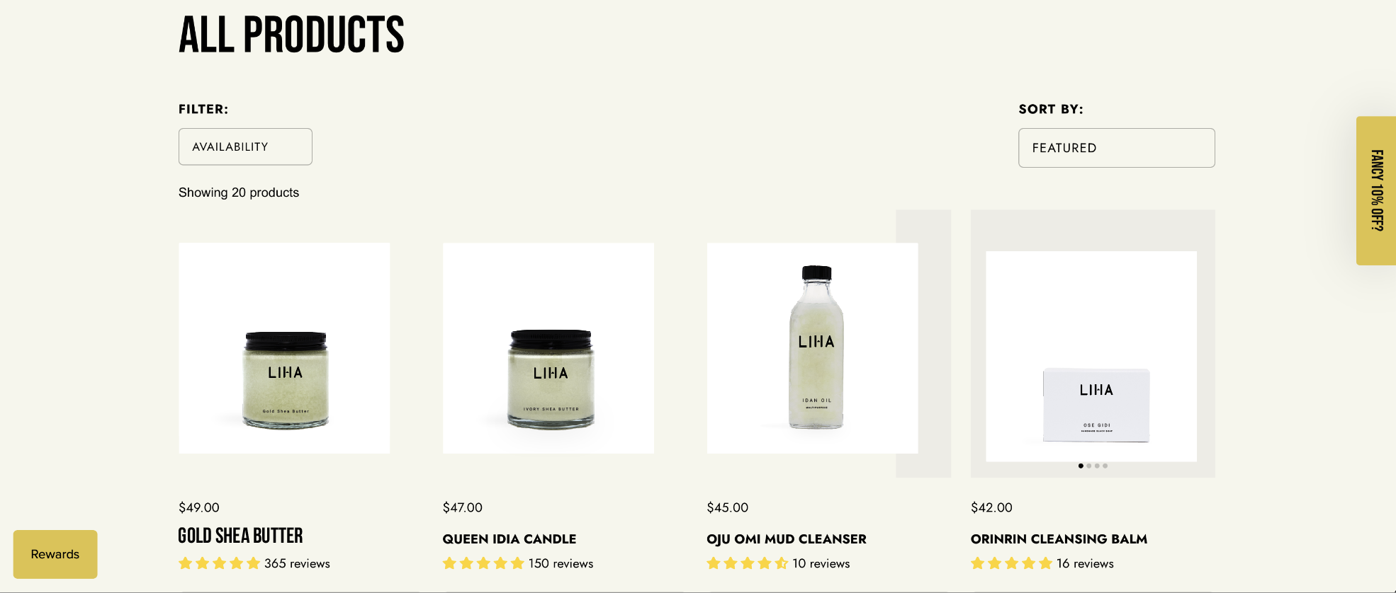
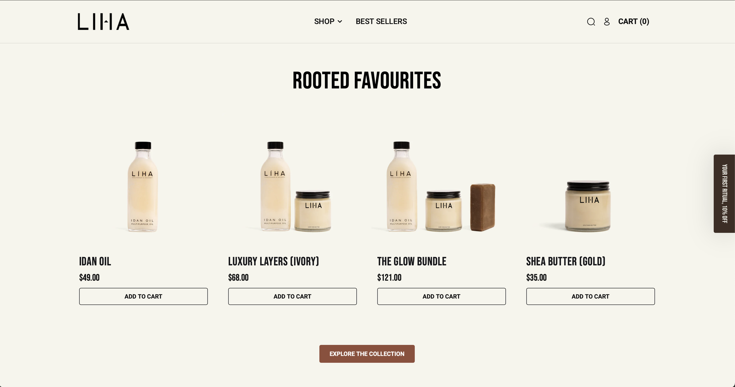
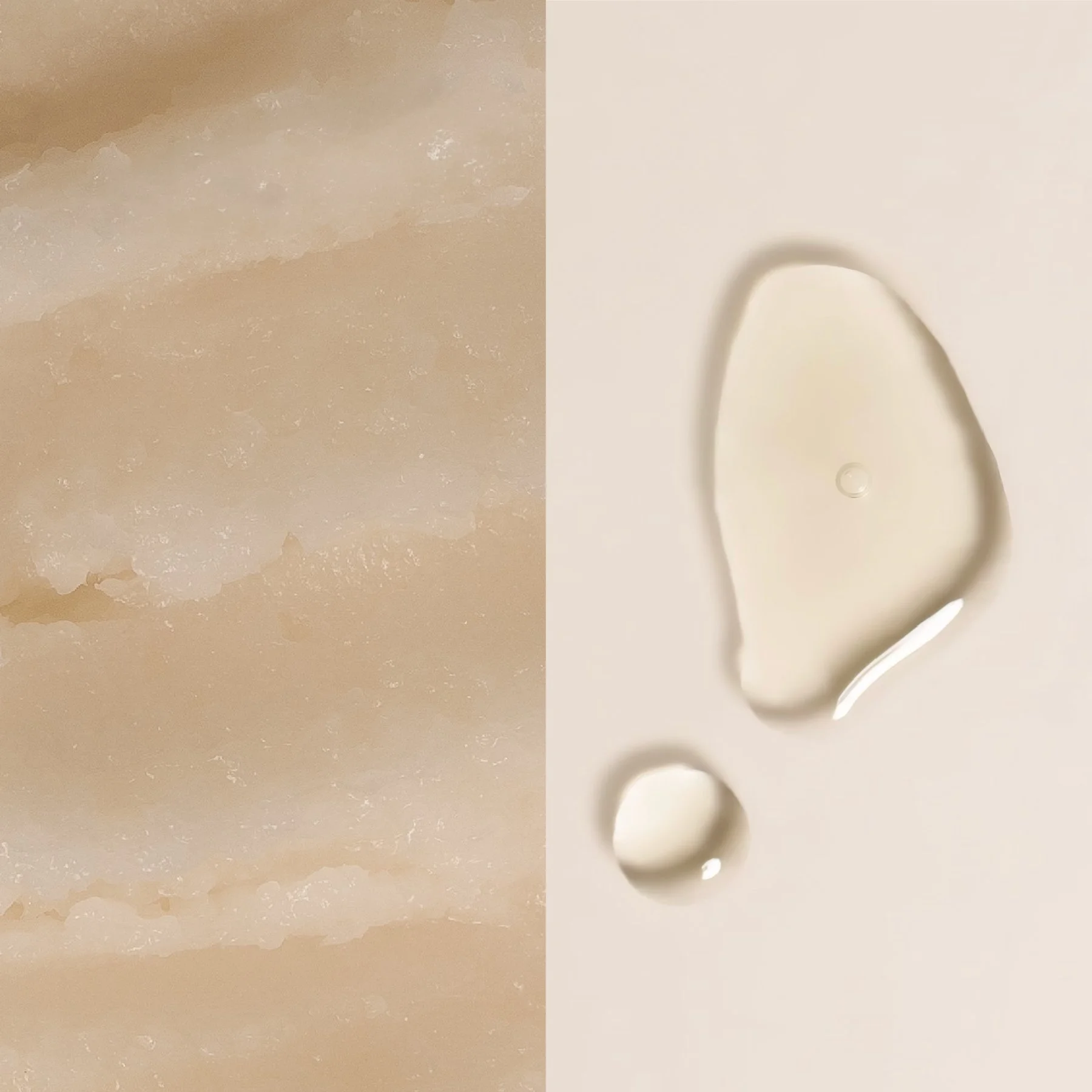
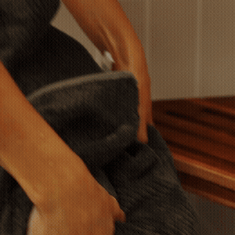
All existing products were re-shot to establish a unified visual standard across the site. A consistent system for scale, alignment, and proportion was implemented, ensuring every product reads cohesively within the broader assortment. Color accuracy was carefully controlled to reflect true-to-life tones, supported by balanced lighting and soft shadowing. Backgrounds were simplified to remove visual noise and prioritize product clarity. This approach created a consistent and scalable foundation for product imagery, elevating both the perception of quality and the overall user experience. Before (below) and after is on the (right).
product EXPERIENCE
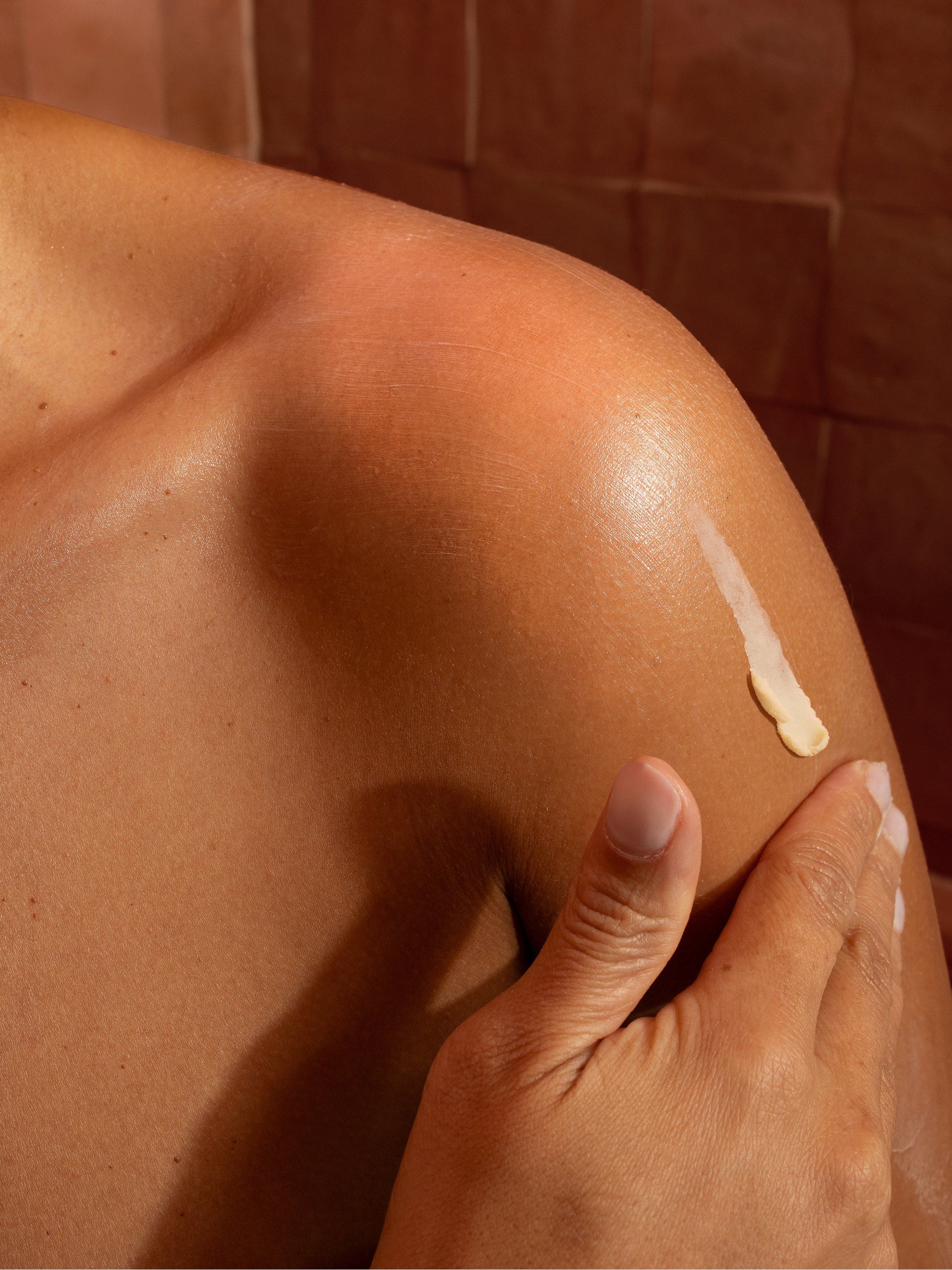
Product pages were restructured to create a more intentional and informative user journey. Content hierarchy was refined to prioritize clarity, allowing customers to quickly understand product function, texture, and use. Motion was introduced to demonstrate application and transformation, adding a more dynamic and sensory layer to the experience. Each touchpoint was designed to guide the user from discovery to decision with greater confidence and ease.
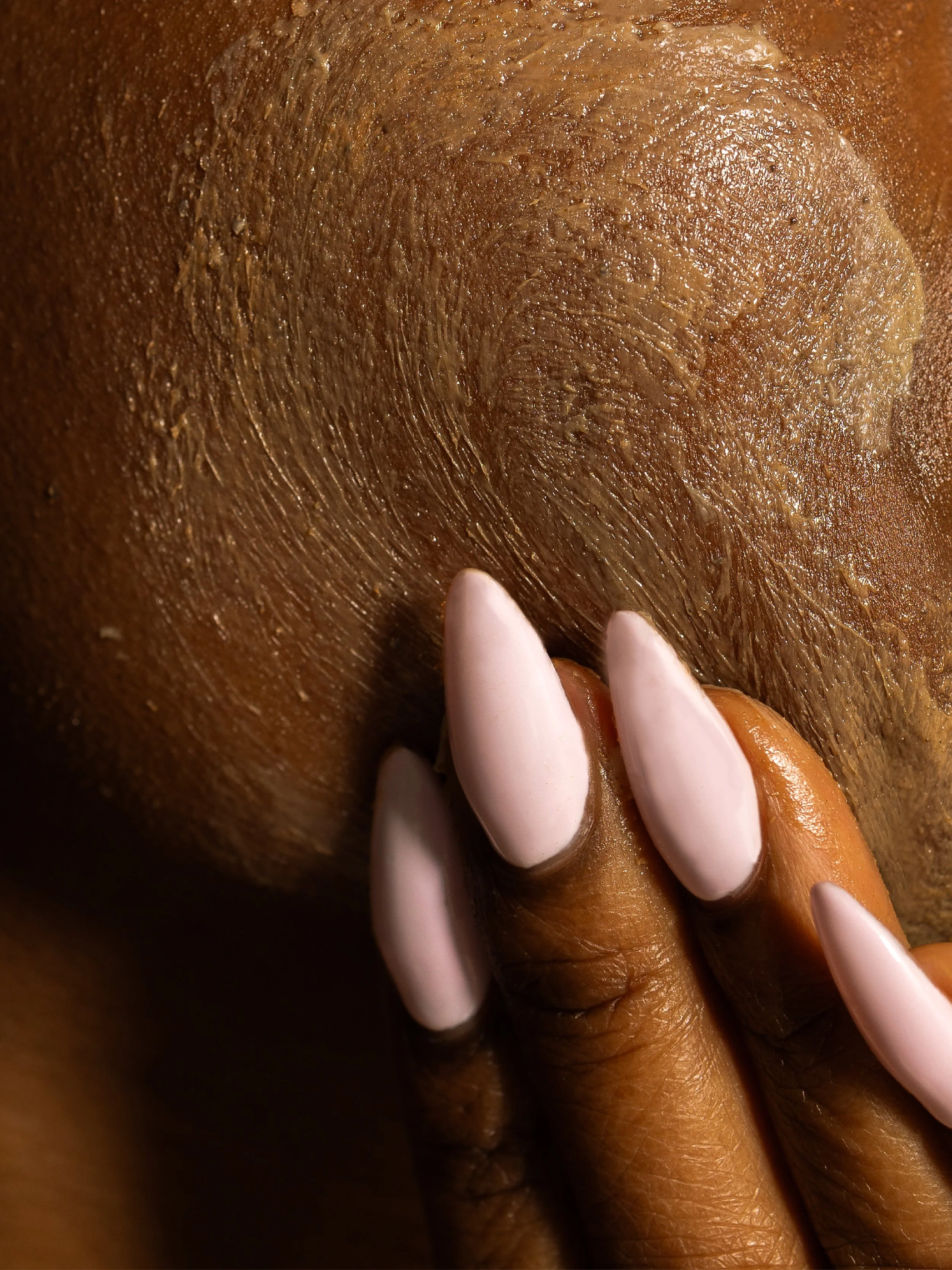
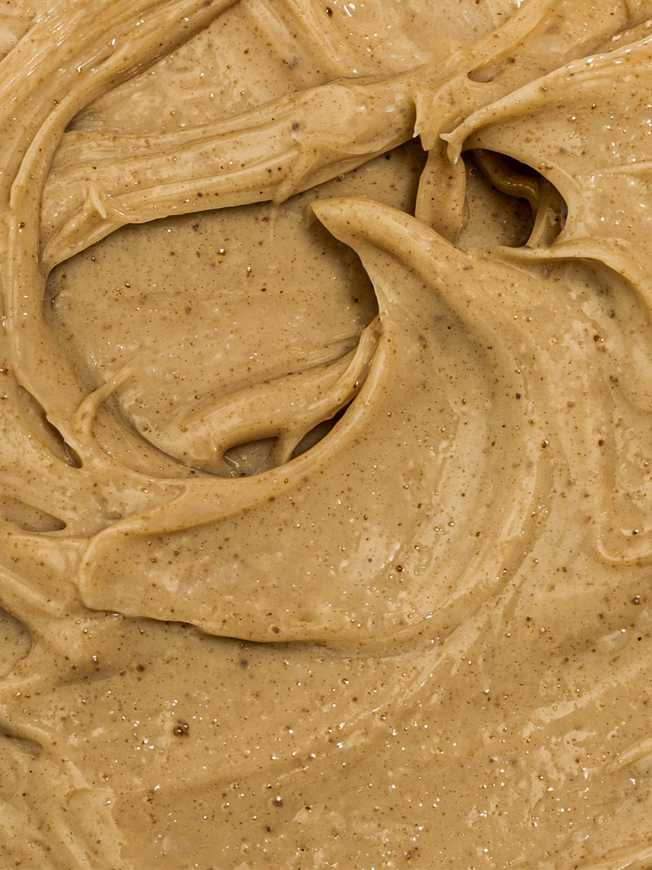
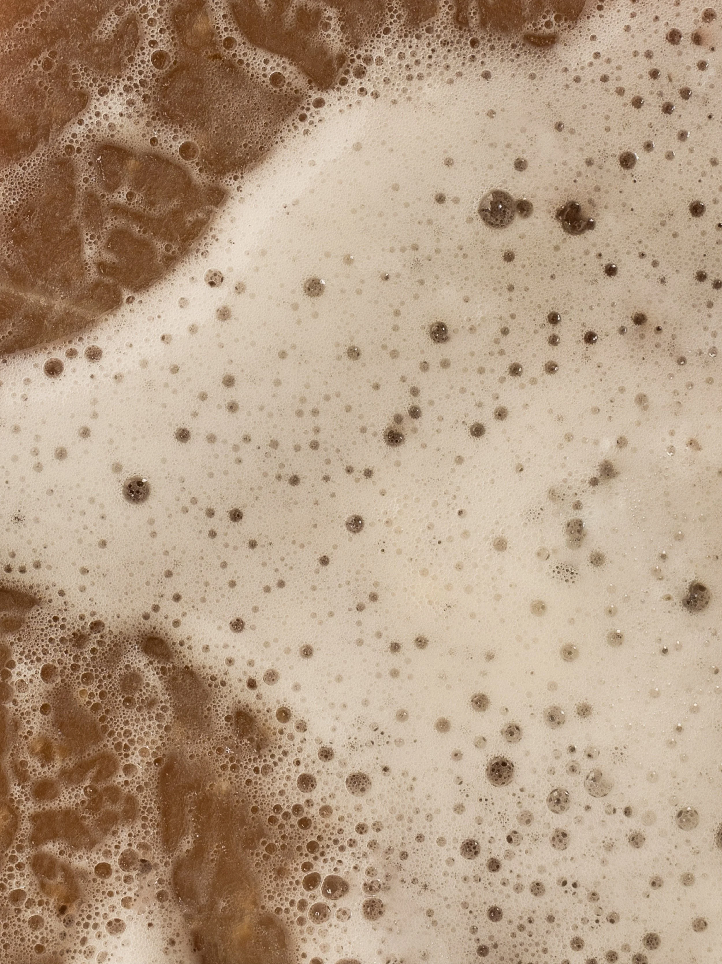
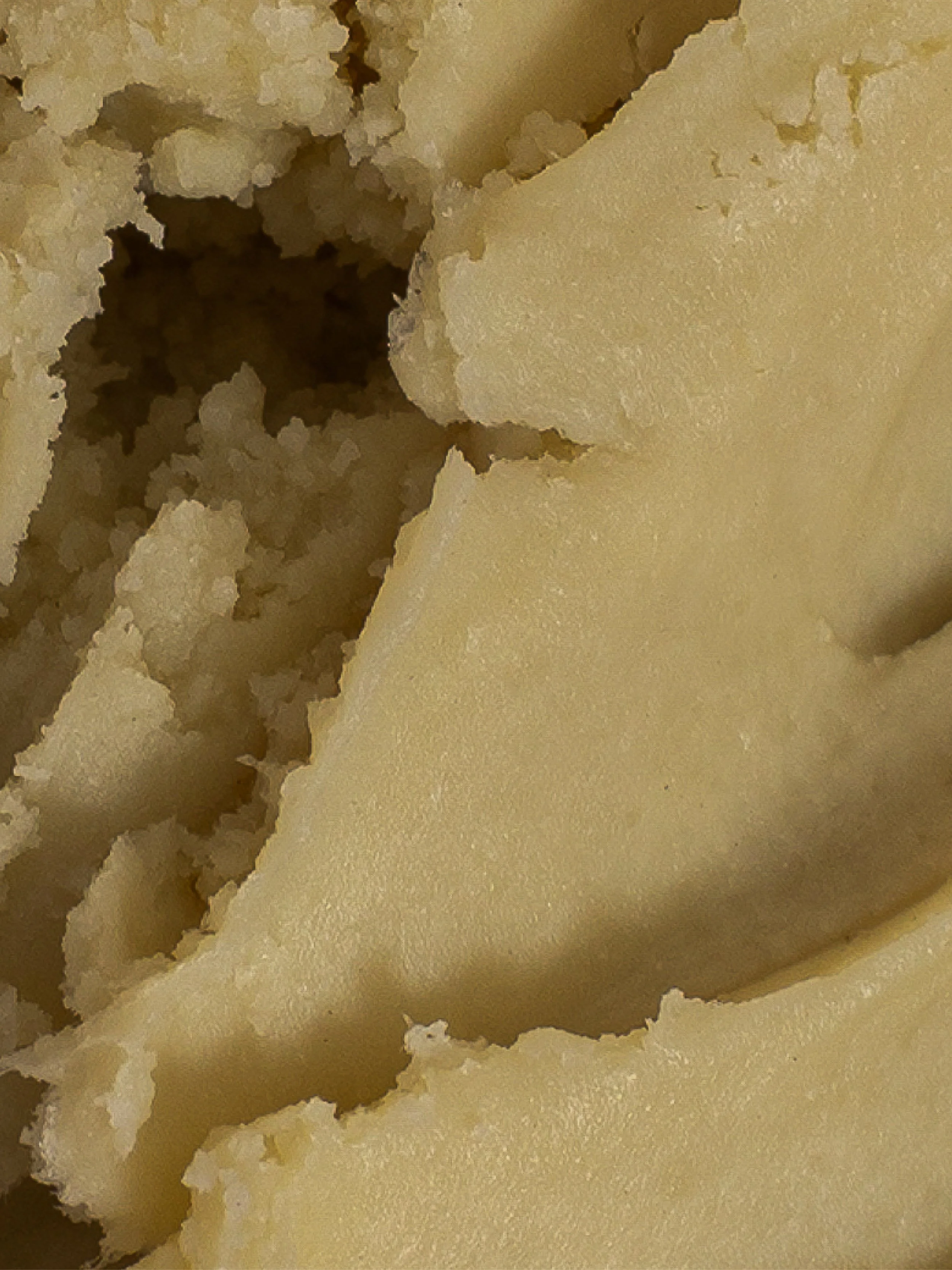
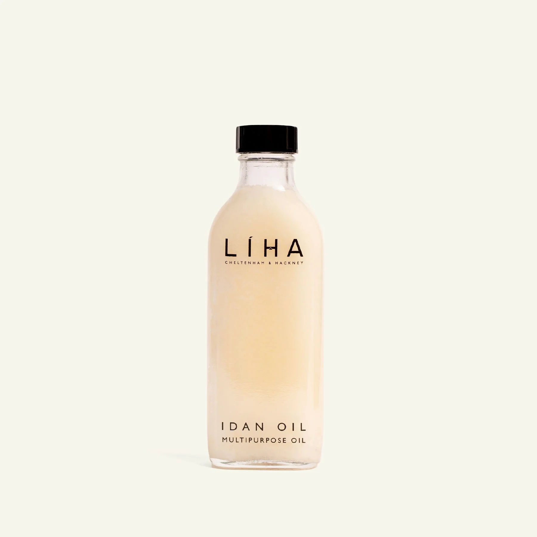
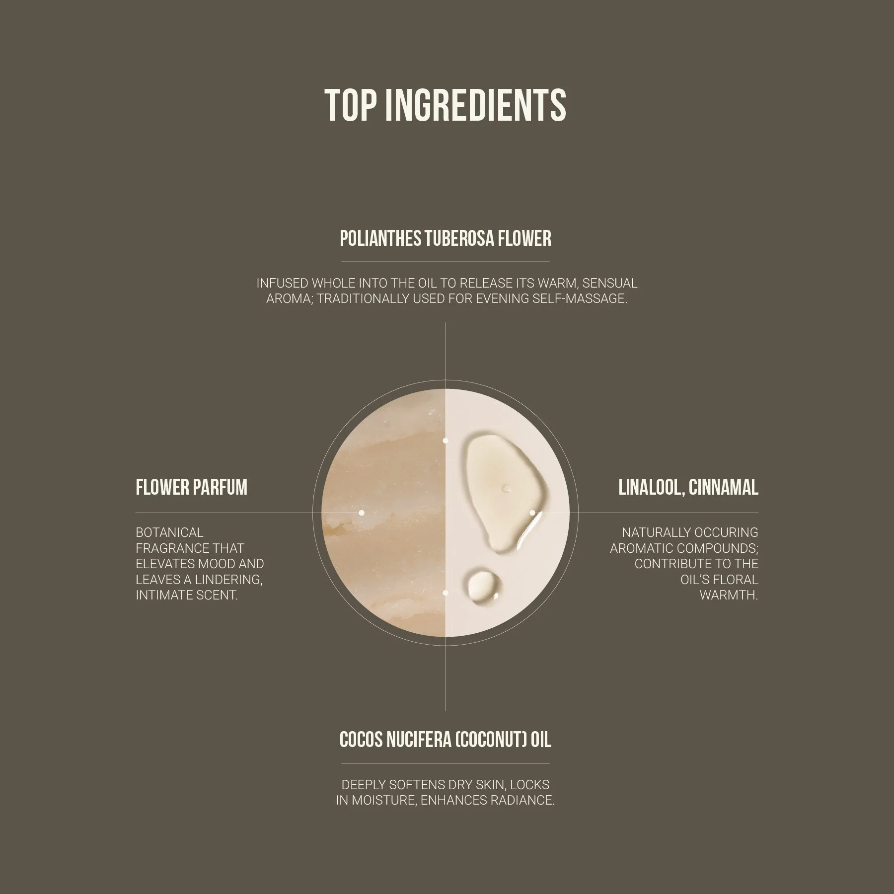
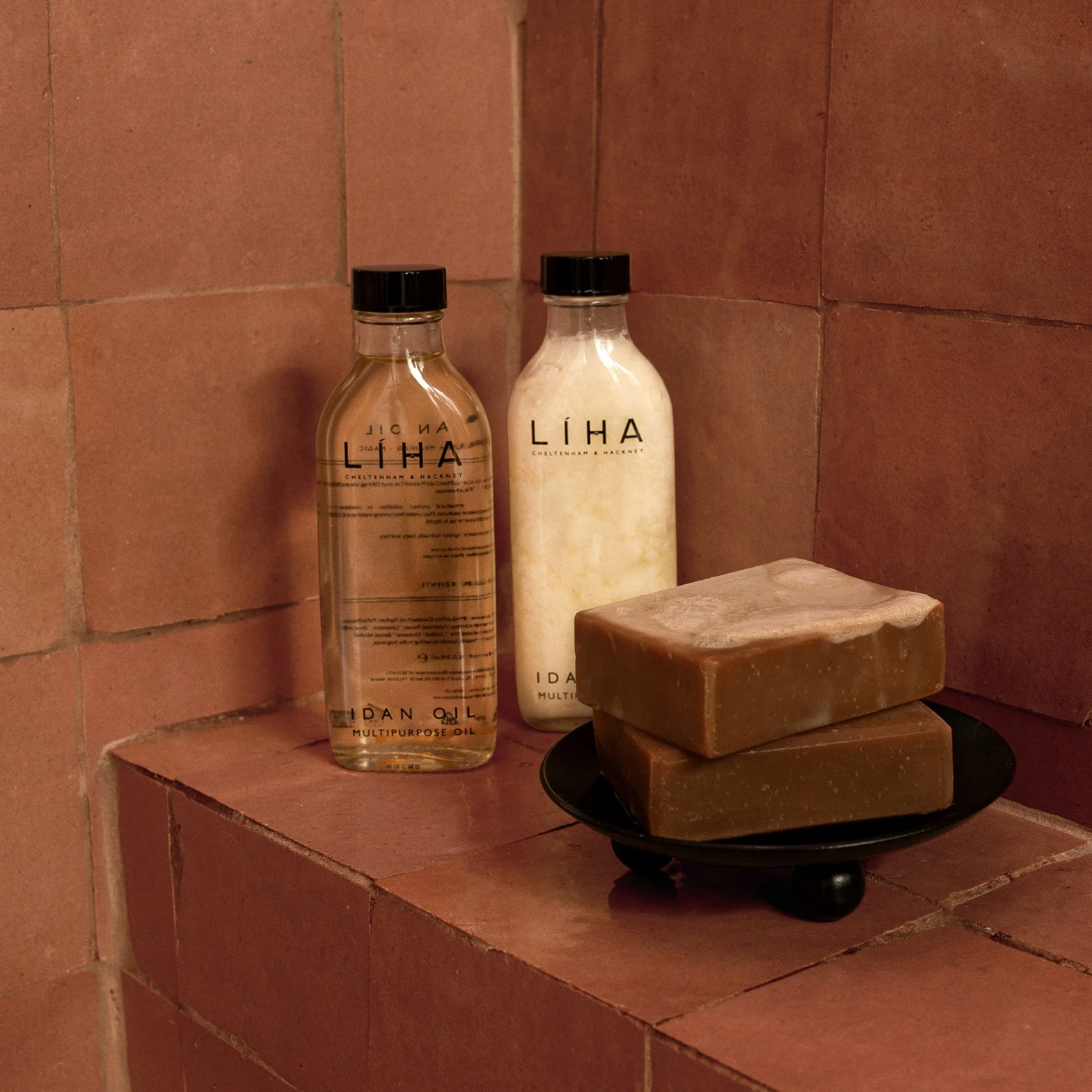
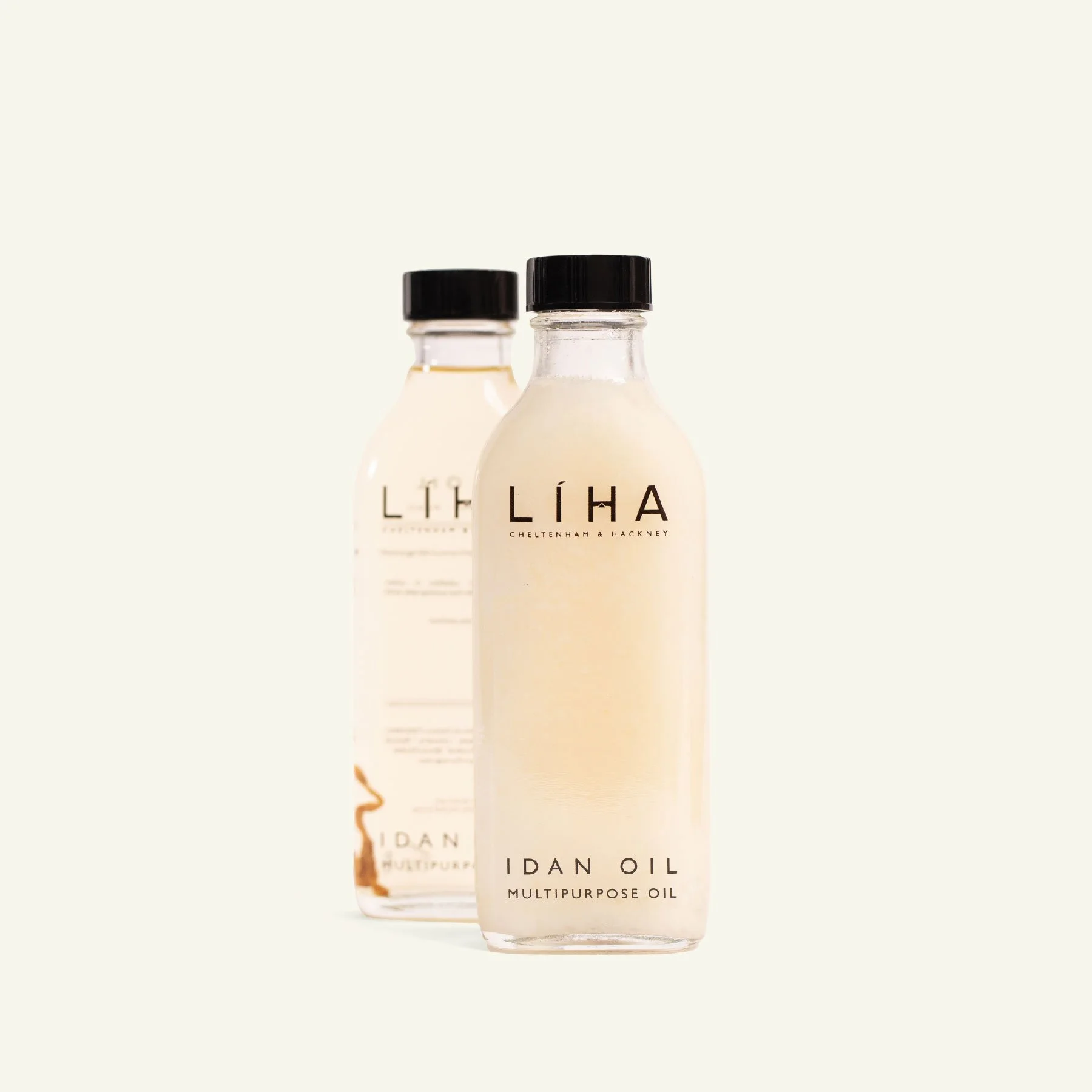
PRODUCT CAROUSEL System
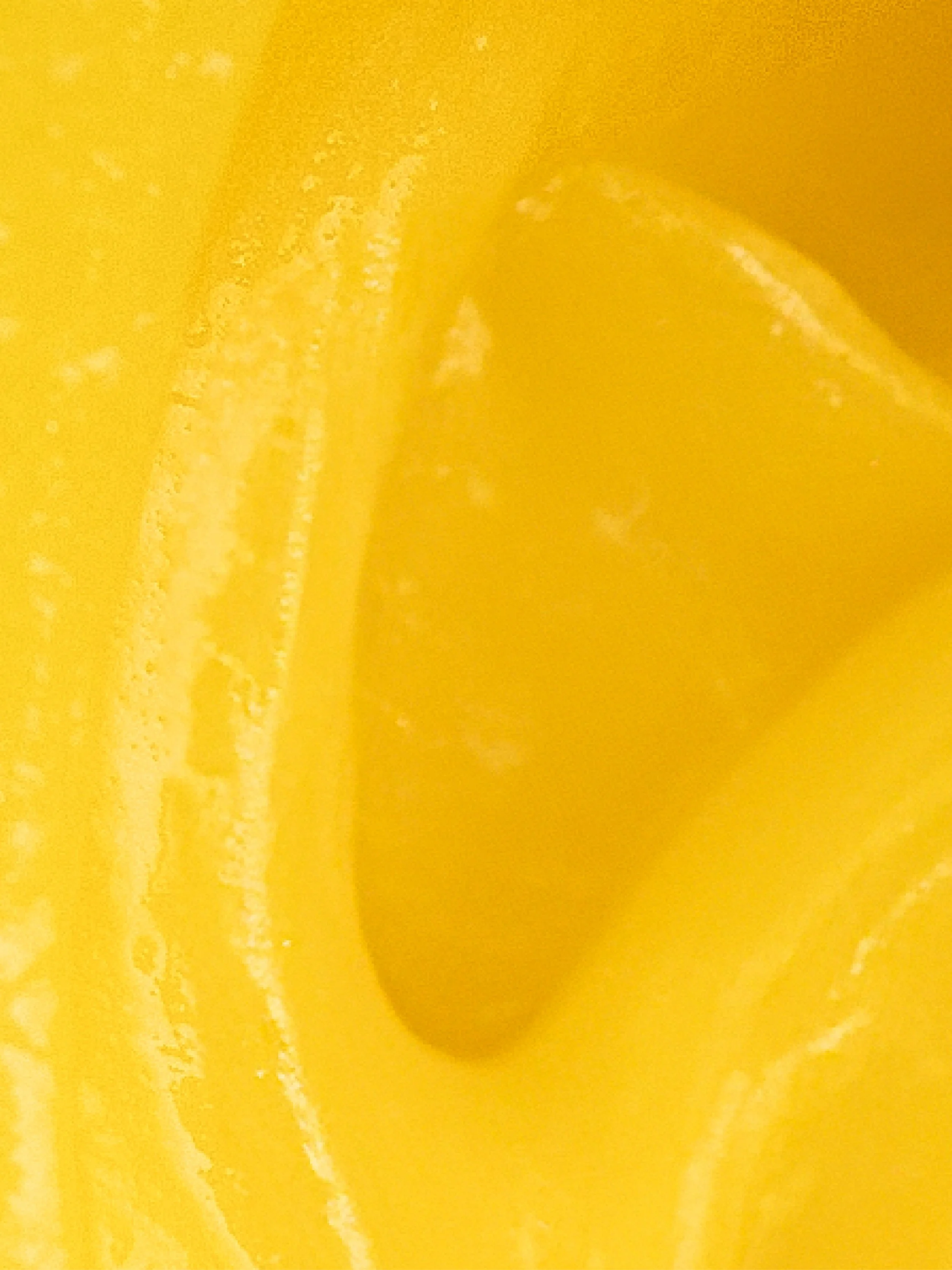
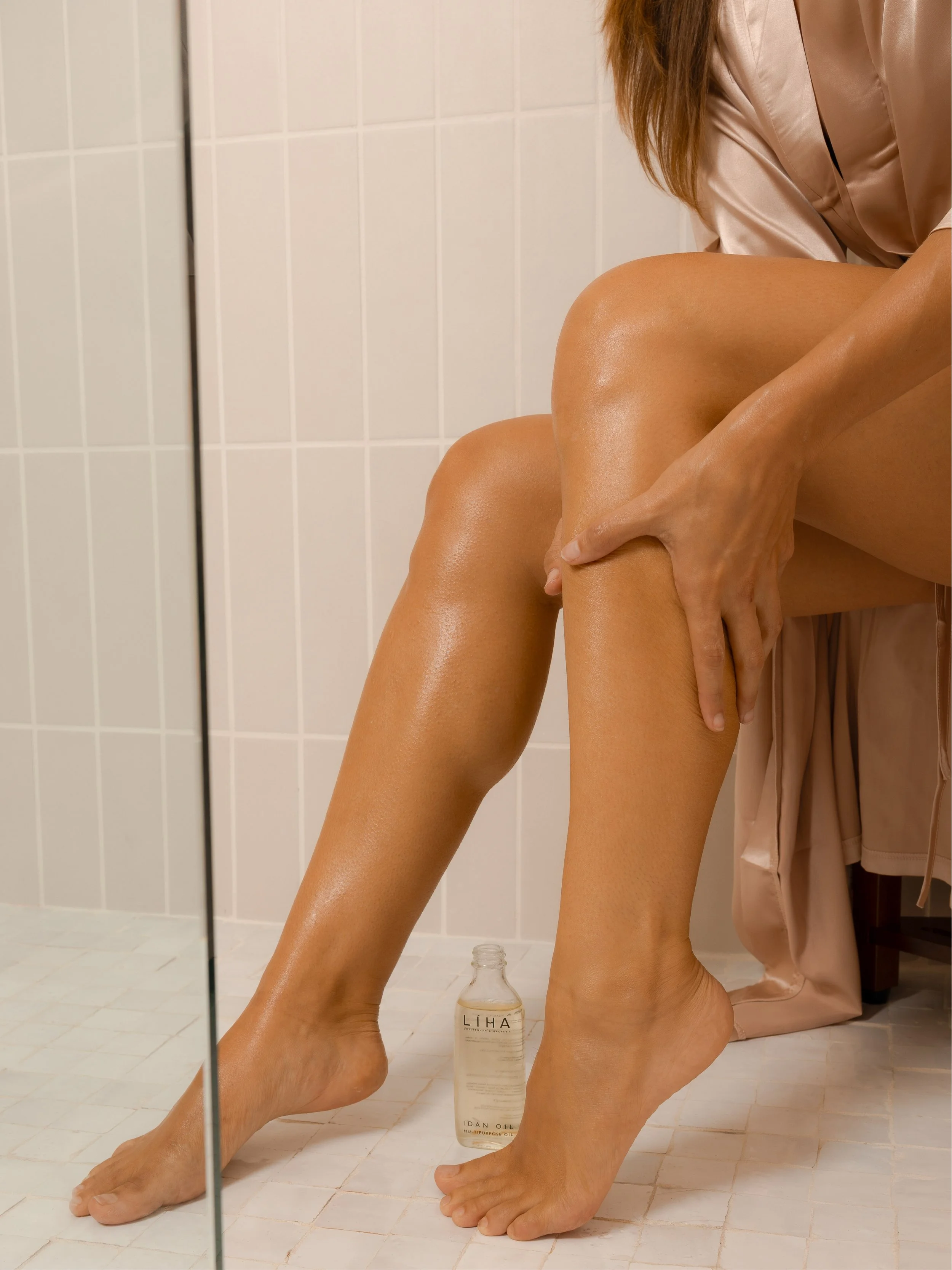
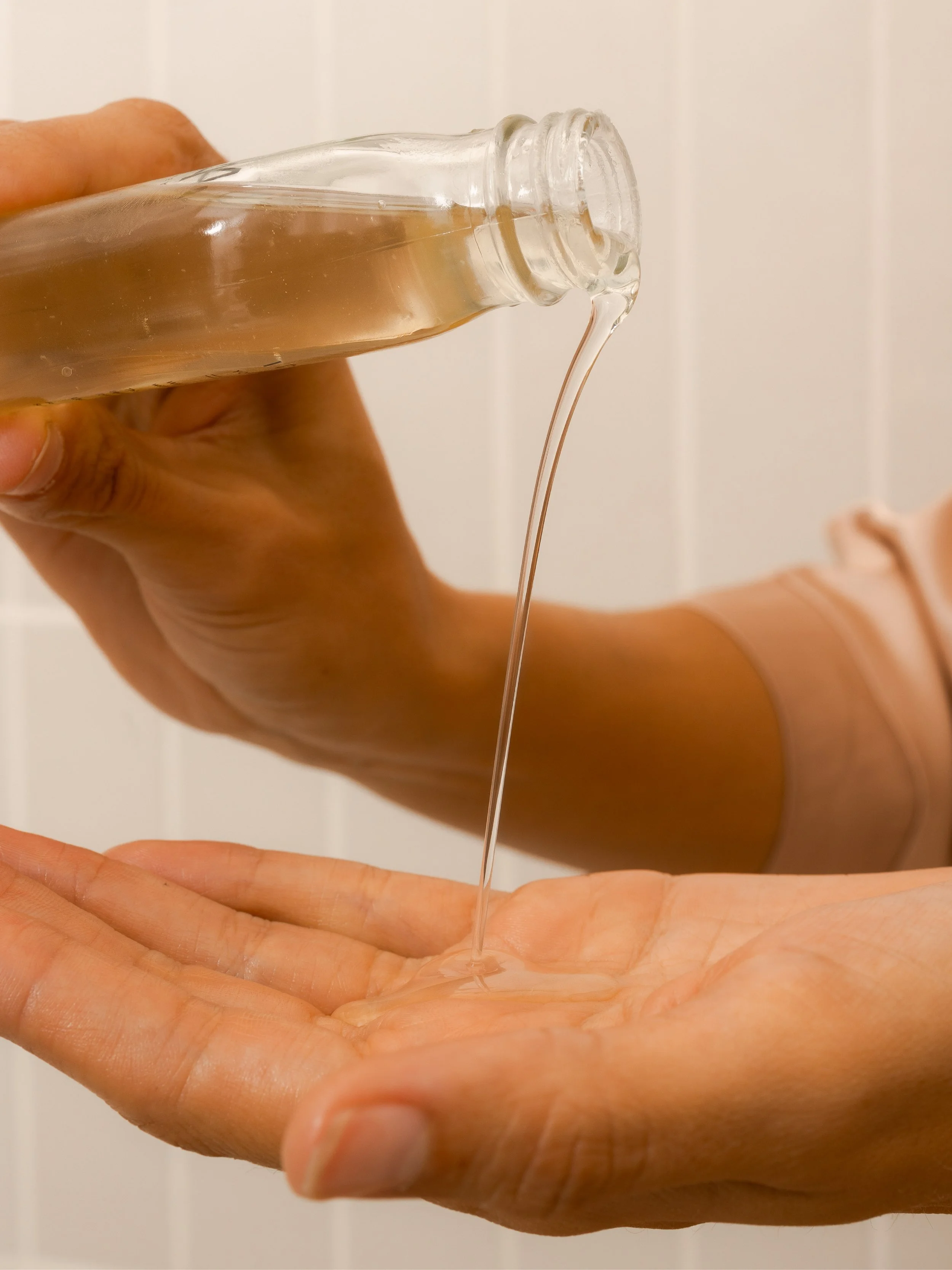
A standardized carousel framework was developed and applied across all product pages to ensure consistency and clarity at scale. Each product follows a defined sequence: clean product imagery, texture or formulation detail, ingredient or benefit highlights, and product-in-use moments. This structure allows customers to understand how a product looks, feels, and performs within a single, cohesive flow. While the sequence shown highlights Idan Oil, this system was implemented across the full product range to maintain continuity across all SKUs.
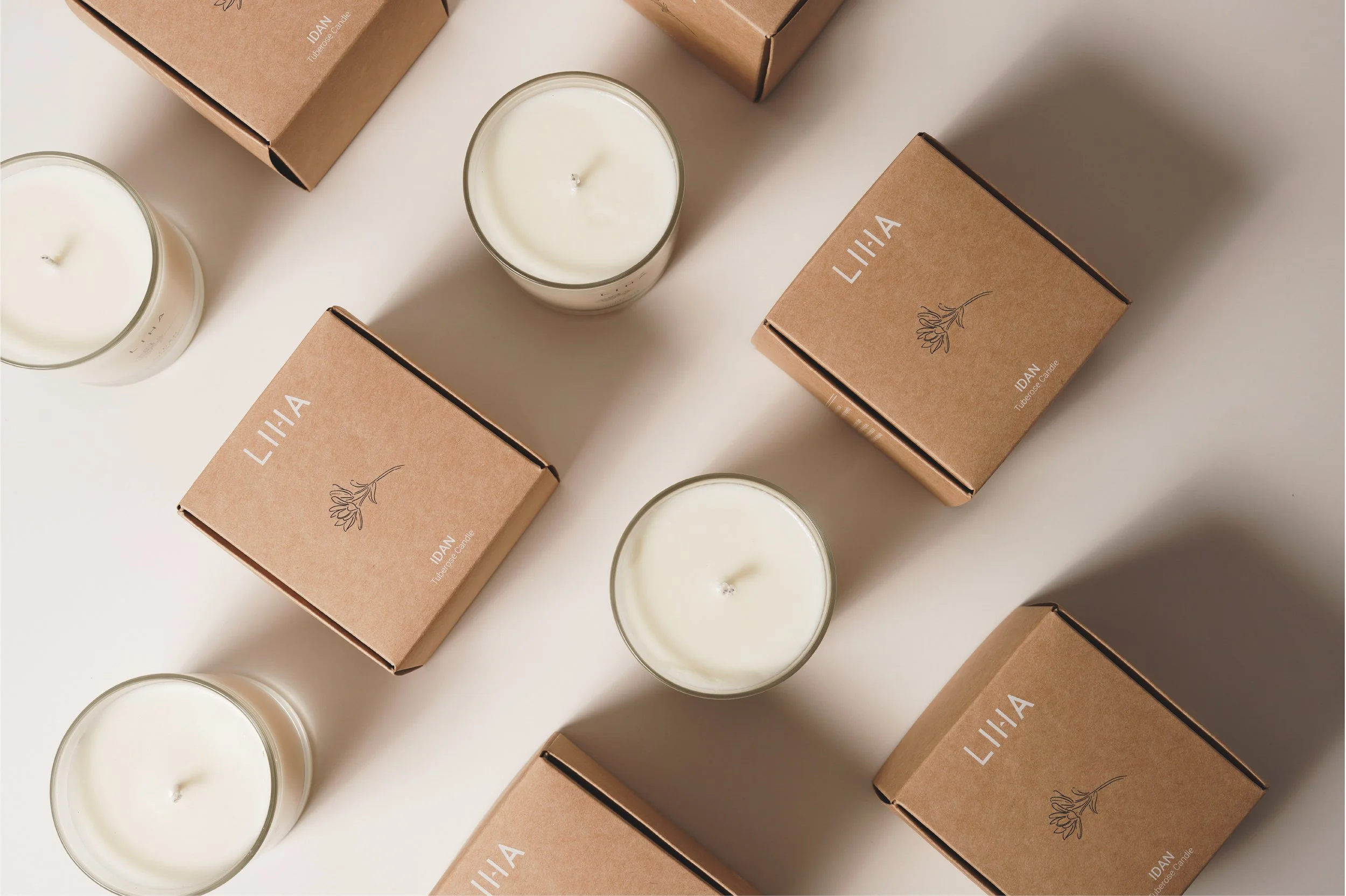
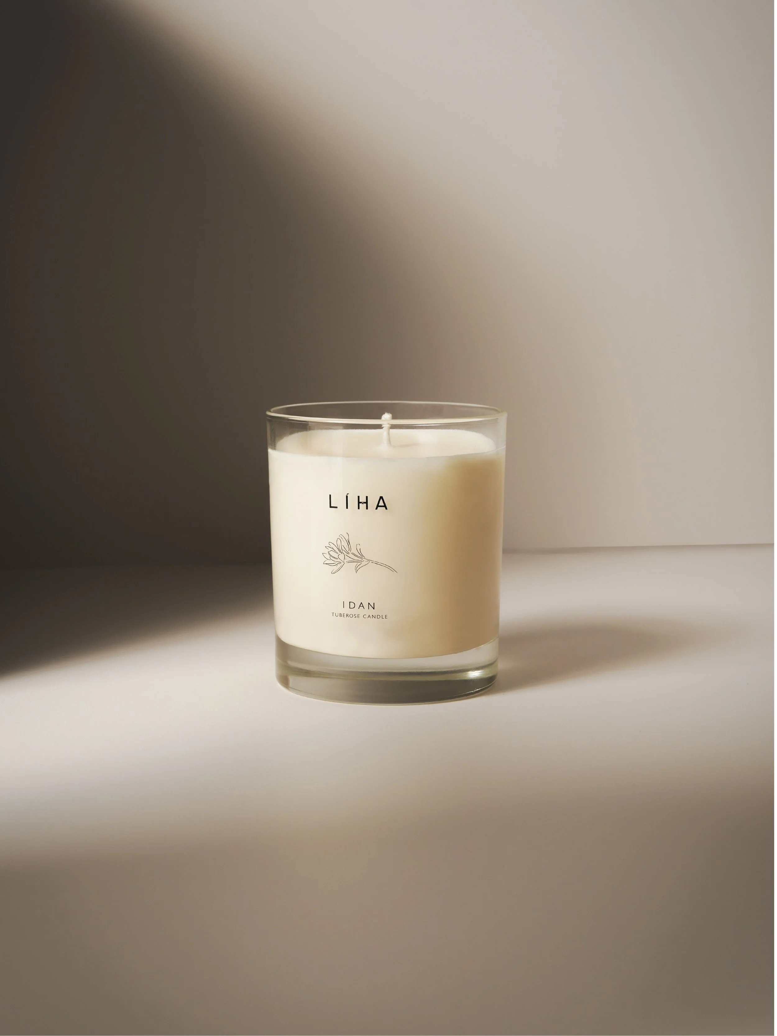
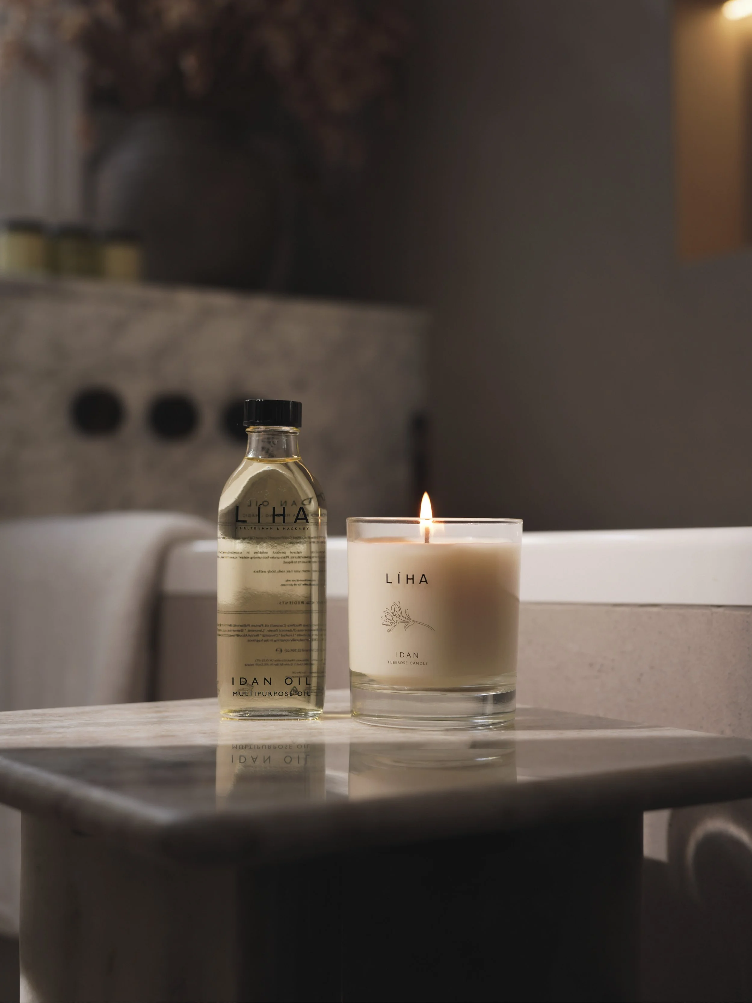
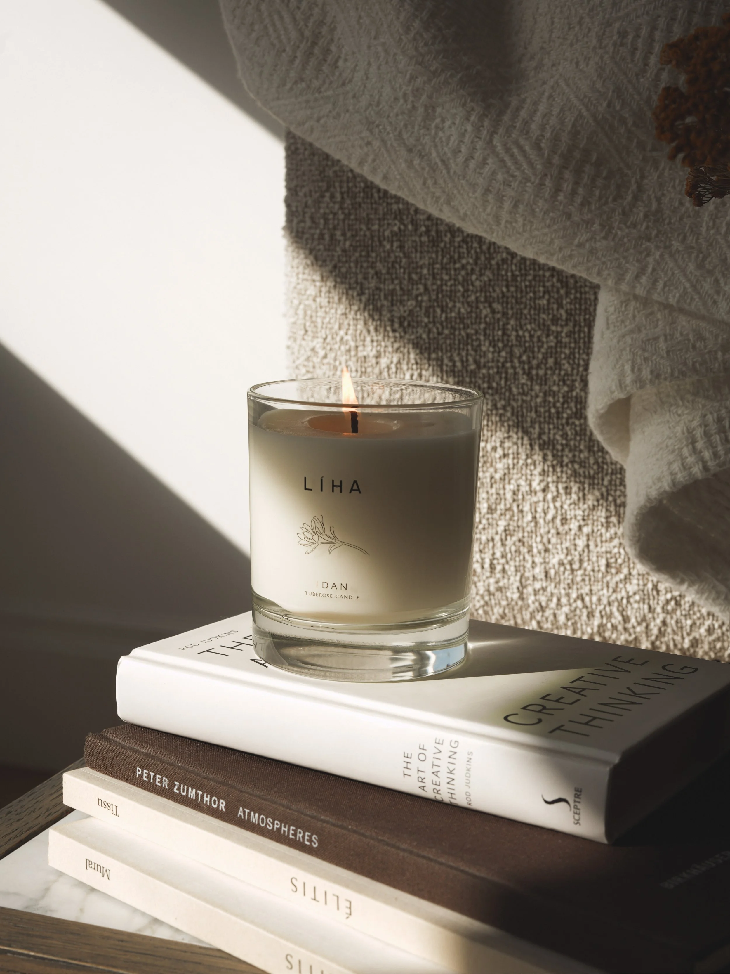
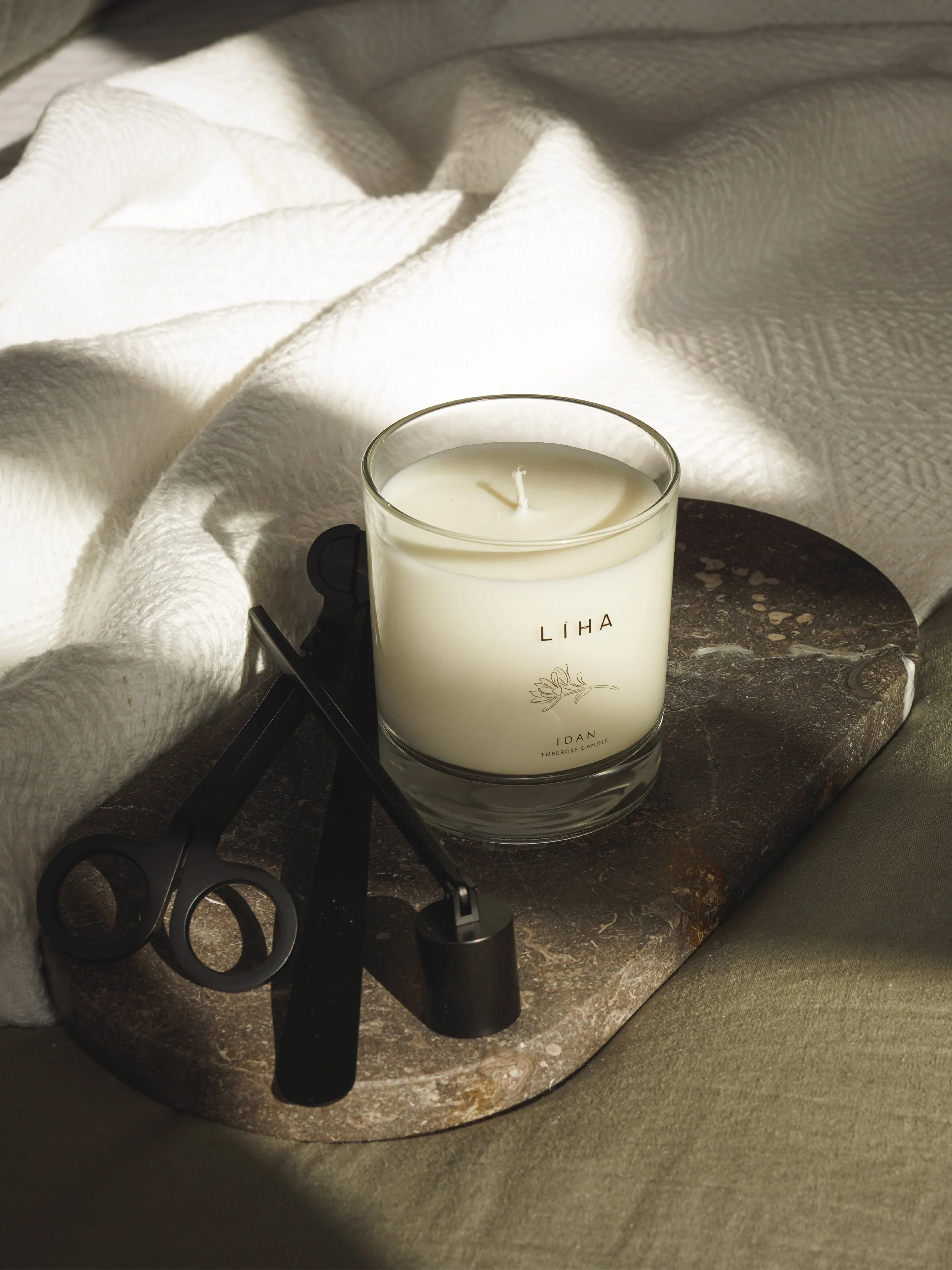
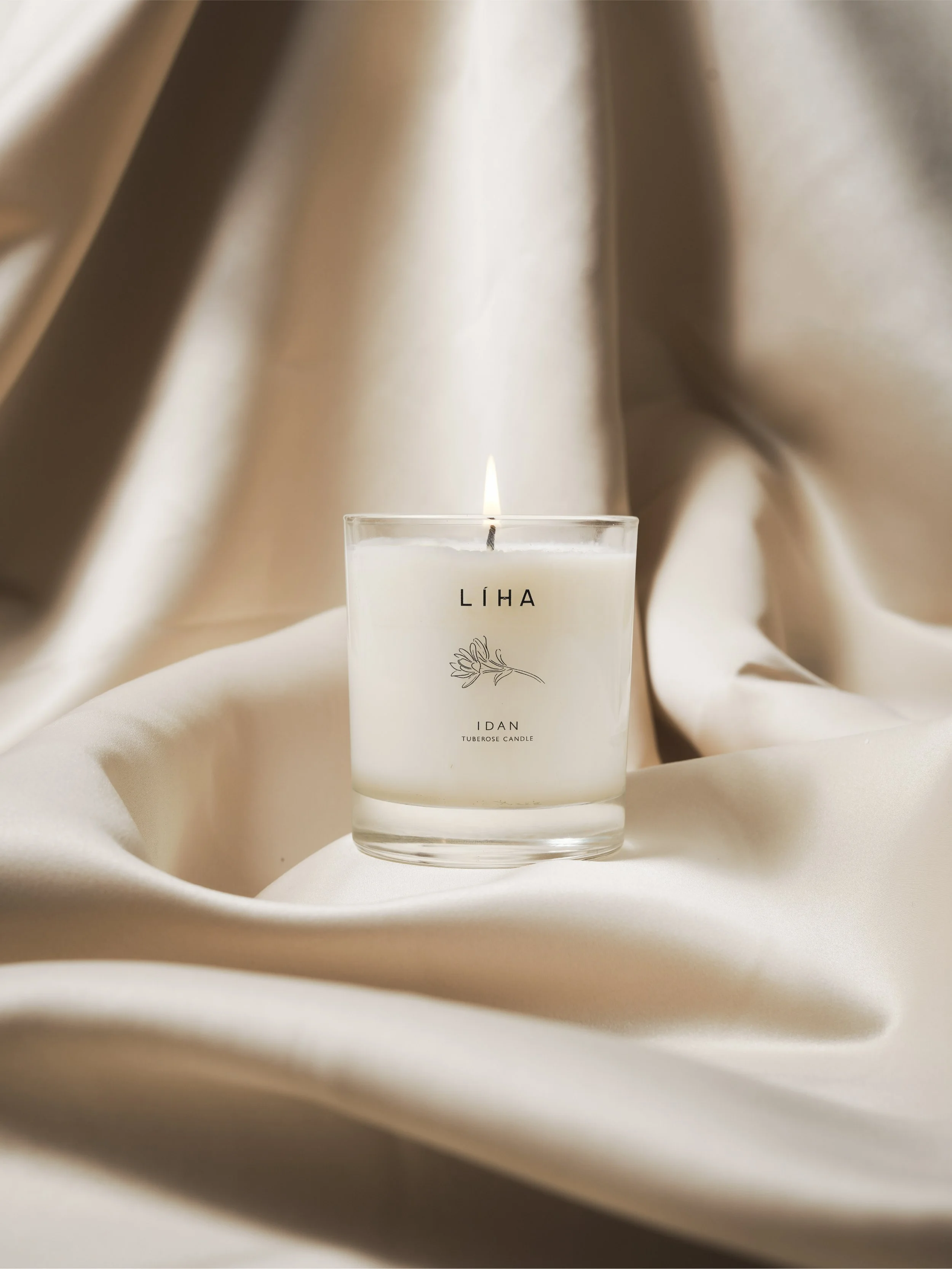
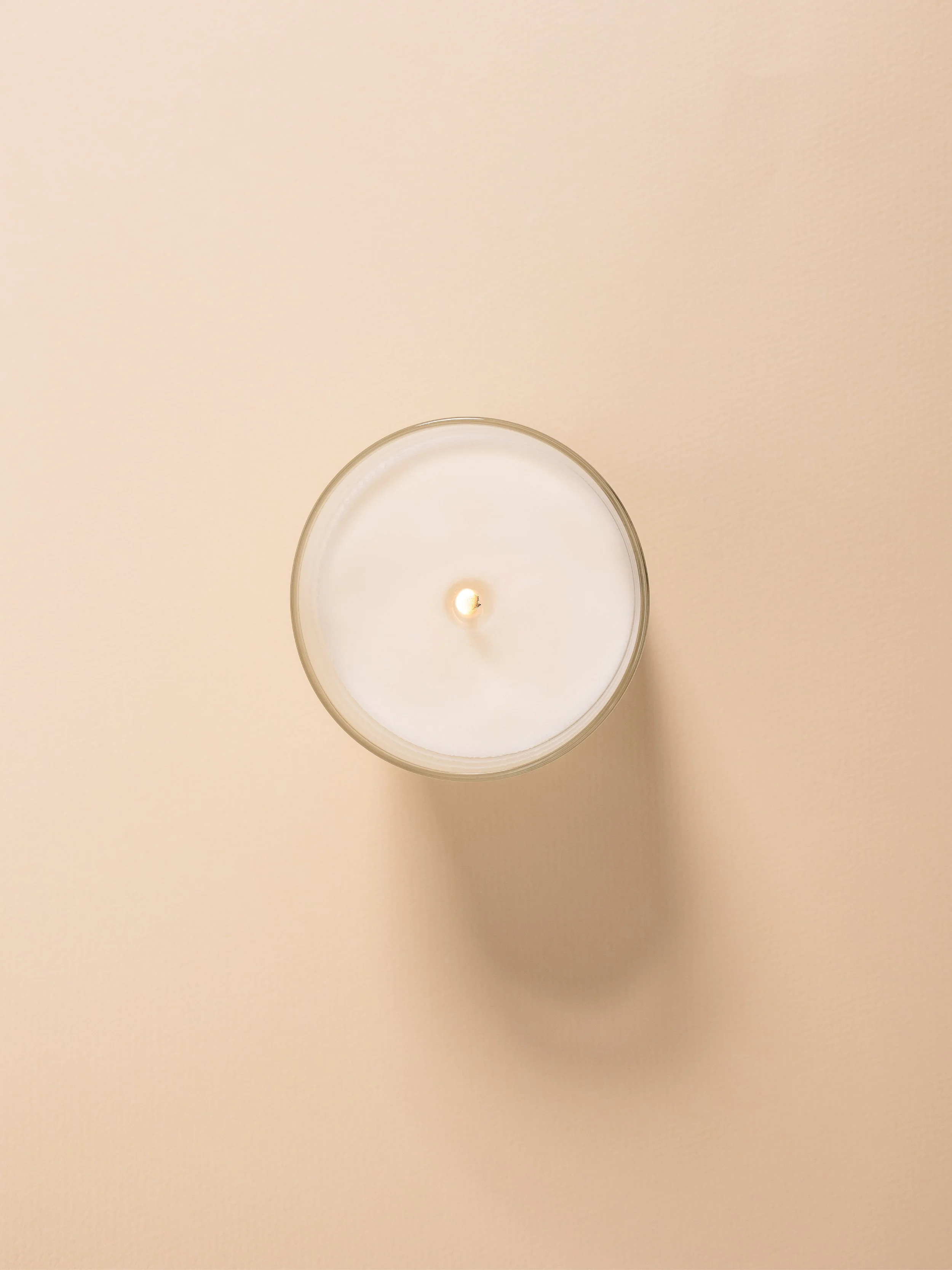
System Extension
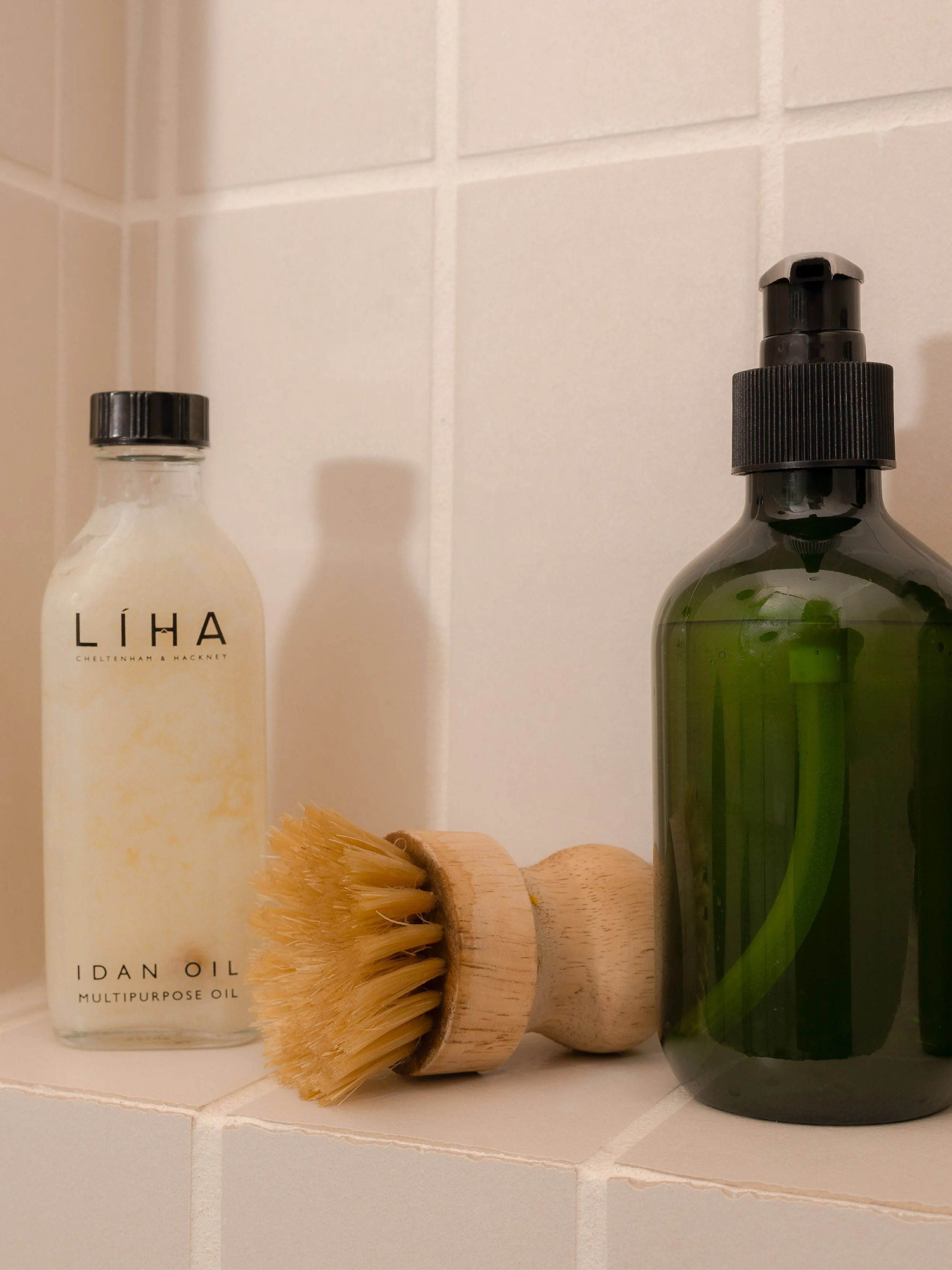
The visual system extends into new product development, ensuring consistency as the brand evolves.
As LIHA Beauty expands beyond its hero Idan Oil into new offerings, including the upcoming Idan Tuberose Candle, the same principles of lighting, materiality, and composition are carried through. This approach maintains a cohesive visual identity across both existing products and future launches, reinforcing continuity across every stage of growth.